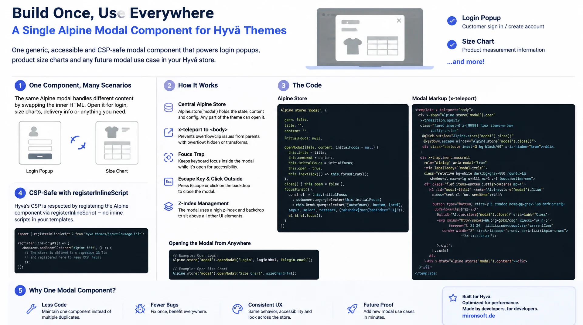
One Component for a Login Popup and a Size Chart
Anyone who builds a new Alpine component for every modal dialog in a Hyvä theme multiplies maintenance effort and bugs around focus handling, the Escape key and z-index. This article shows how a single generic Alpine modal component, driven by Alpine.store, powers both a login popup and a product size chart on the PDP at the same time, including x-teleport against overflow clipping, focus trap, Escape and click-outside handling, and a CSP-safe implementation with registerInlineScript.
Table of Contents
- 1. Why modal dialogs in Hyvä need a dedicated pattern
- 2. Designing a generic Alpine modal component
- 3. Alpine.store as the central modal registry
- 4. x-teleport: moving modal markup to the end of body
- 5. Click-outside and Escape to close
- 6. Focus management and focus trap
- 7. Transitions with x-transition for backdrop and panel
- 8. Login modal and size chart: two use cases, one component
- 9. Modal dialogs compared: Luma/Bootstrap vs. Alpine
- 10. Summary
- 11. FAQ
1. Why modal dialogs in Hyvä need a dedicated pattern
Hyvä deliberately drops Bootstrap, jQuery and Magento's UI components: which also means the Bootstrap modal known from Luma, the one that handled login popups, size charts and cookie notices with a single JS library, is gone. In practice this quickly leads to several ad-hoc solutions: an x-show for the login popup here, a separate x-data construct for the size chart there, each with its own logic for opening, closing and focus. A clean modal dialog, however, always needs the same building blocks, regardless of whether it shows a login form or a CMS size chart.
This is exactly where a generic Alpine modal component comes in: a single, reusable pattern built from x-data, Alpine.store and x-teleport that can be referenced by ID anywhere in the theme. Instead of implementing focus handling, the Escape key and backdrop clicks over and over for every new modal dialog, the component is registered once, centrally, and bound via an ID such as login or size-chart. That cuts down on duplicated code, unifies accessibility behavior, and turns new use cases into a question of markup, not new JavaScript logic.
2. Designing a generic Alpine modal component
The core of any Alpine modal pattern is an Alpine.data factory parameterized by a modal ID. The component itself does not hold its own open/closed state: that lives centrally in the store (more on that in the next section). Instead, modalDialog(id) encapsulates the behavior: a computed property isOpen that queries the store, an open() method that remembers the last focused element, and a close() method that returns focus on close.
This separation (state in the store, behavior in the component) is the key difference from a naive x-data="{ open: false }" per modal. It allows a trigger button somewhere in the header and the actual modal dialog at the end of <body> to coexist without sharing the same x-data scope. The component's init() hook also registers a watcher on isOpen that automatically focuses the first focusable element in the panel once it opens: a detail that most ad-hoc modals simply lack.
document.addEventListener('alpine:init', () => {
  // Generic modal component, parameterized by a modal id.
  // State (which modal is active) lives in the store, not here.
  Alpine.data('modalDialog', (modalId) => ({
    modalId: modalId,
    triggerEl: null,

    get isOpen() {
      return this.$store.modal.active === this.modalId;
    },

    open(triggerEl = null) {
      // Remember the element that triggered the modal to restore focus later
      this.triggerEl = triggerEl || document.activeElement;
      this.$store.modal.open(this.modalId);
    },

    close() {
      this.$store.modal.close();
      this.$nextTick(() => {
        if (this.triggerEl) {
          this.triggerEl.focus();
        }
      });
    },

    init() {
      this.$watch('isOpen', (value) => {
        if (value) {
          this.$nextTick(() => this.focusFirstElement());
        }
      });
    },

    focusFirstElement() {
      const panel = this.$refs.panel;
      if (!panel) return;
      const selector = 'button, a[href], input, select, textarea, [tabindex]:not([tabindex="-1"])';
      const focusable = panel.querySelector(selector);
      if (focusable) focusable.focus();
    }
  }));
});
3. Alpine.store as the central modal registry
Most shops have several places that can open the same modal dialog: the login link in the header, the account icon in the mobile navigation, and possibly a checkout prompt asking the customer to sign in. All three should open the same login popup, not three independent copies of it. The solution is a global Alpine.store('modal', ...) that holds exactly one property: the ID of the currently active modal. Every trigger button simply calls $store.modal.open('login'), no matter where it sits in the DOM.
This central modal registry solves two problems at once: first, only one modal dialog can ever be active at a given time: a second call to open() simply overwrites the active ID, so no stacked overlays appear. Second, body scrolling can be locked in one central place whenever any modal is open, without every single component managing that itself. The isOpen(id) method also makes the store queryable from x-show bindings in arbitrary templates, without those templates needing to know the internal state of any particular component.
document.addEventListener('alpine:init', () => {
  // Central registry: exactly one modal id can be active at a time
  Alpine.store('modal', {
    active: null,

    open(id) {
      this.active = id;
      document.documentElement.classList.add('overflow-hidden');
    },

    close() {
      this.active = null;
      document.documentElement.classList.remove('overflow-hidden');
    },

    isOpen(id) {
      return this.active === id;
    }
  });
});
4. x-teleport: moving modal markup to the end of body
A modal dialog that sits deeply nested somewhere in the markup, for example inside a product slider or a header with overflow-hidden, gets clipped by its parent element or covered by a different stacking context. This is exactly the problem x-teleport solves: the directive moves the DOM node to a different place in the document at runtime while keeping the reactive Alpine scope intact. For Alpine modal components, x-teleport="body" is the default choice: the panel then lands guaranteed outside of every parent stacking context and every overflow: hidden.
It's important that x-teleport only works on a <template> element, not directly on a <div>. The template itself stays in its original place in the source code, only the rendered content is moved to the end of <body>. This lets the trigger button and the dialog stay logically together in the phtml template, for example in the same block, while the actual DOM position is completely decoupled from that. The z-50 z-index on the root element is then enough, since there are no more deeply nested parent elements in the way.
<!-- Trigger button anywhere in the header markup -->
<button
    type="button"
    class="text-sm font-semibold text-gray-700 hover:text-orange-600"
    x-data
    @click="$store.modal.open('login')"
>
    Login
</button>

<!-- Modal markup: logically kept next to the trigger, physically teleported to body -->
<template x-teleport="body">
    <div
        x-data="modalDialog('login')"
        x-show="isOpen"
        x-cloak
        class="fixed inset-0 z-50"
        role="dialog"
        aria-modal="true"
        aria-labelledby="login-modal-title"
        @keydown.escape.window="isOpen && close()"
    >
        <div
            class="fixed inset-0 bg-gray-900/60"
            x-show="isOpen"
            x-transition:enter="transition ease-out duration-200"
            x-transition:enter-start="opacity-0"
            x-transition:enter-end="opacity-100"
            x-transition:leave="transition ease-in duration-150"
            x-transition:leave-start="opacity-100"
            x-transition:leave-end="opacity-0"
            @click="close()"
        ></div>

        <div class="fixed inset-0 flex items-center justify-center p-4">
            <div
                x-ref="panel"
                x-show="isOpen"
                x-transition:enter="transition ease-out duration-200"
                x-transition:enter-start="opacity-0 scale-95"
                x-transition:enter-end="opacity-100 scale-100"
                x-transition:leave="transition ease-in duration-150"
                x-transition:leave-start="opacity-100 scale-100"
                x-transition:leave-end="opacity-0 scale-95"
                class="bg-white rounded-2xl shadow-xl max-w-md w-full p-6"
            >
                <h3 id="login-modal-title" class="text-lg font-bold mb-4">Sign In</h3>
                <!-- Login form partial included here -->
            </div>
        </div>
    </div>
</template>
5. Click-outside and Escape to close
A modal dialog must be closable in two ways without forcing the user to hit a close button: by clicking outside the panel and by pressing Escape. For the click-outside case, a dedicated backdrop layer has proven itself in practice: a separate div covering the whole viewport with a simple @click="close()", instead of @click.outside directly on the panel. The reason: @click.outside reacts to any click outside the element, including clicks in other teleported overlays like a datepicker or a native select dropdown that appear visually inside the panel but sit outside it in the DOM.
For the Escape key, @keydown.escape.window is bound to the root element of the modal dialog. The .window modifier makes sure the event is caught regardless of the current focus in the document, even if focus is currently inside a form field within the panel. The condition isOpen && close() ensures that pressing Escape only closes the currently active modal, not some other, invisible modal element that happens to listen for the same event. Together these two patterns fully cover the standard interactions users expect from overlays of this kind.
6. Focus management and focus trap
Accessibility is not optional for a modal dialog, it is a requirement: as soon as the modal opens, keyboard focus must move into the panel, and on close it must return to the original trigger element. That is exactly what the open() method from section 2 handles, storing document.activeElement before opening, along with the watcher that automatically focuses the first focusable element in the panel after opening. Without this behavior, focus stays stuck in the background while the content is visually in the foreground: a classic screen reader bug.
The second building block is the focus trap: while the modal is open, the Tab key must not be allowed to move focus out of the panel onto background elements. This is done by checking, on every Tab keypress, whether focus currently sits on the last focusable element in the panel, if so, focus jumps back to the first element, and vice versa on Shift+Tab. This logic can be implemented as a simple function and bound via @keydown.tab on the panel, with no external focus-trap library needed.
// Cycles Tab focus within the modal panel, called via @keydown.tab on x-ref="panel"
function trapFocus(event, panelEl) {
  const selector = 'button, a[href], input, select, textarea, [tabindex]:not([tabindex="-1"])';
  const focusableElements = panelEl.querySelectorAll(selector);
  if (focusableElements.length === 0) return;

  const firstElement = focusableElements[0];
  const lastElement = focusableElements[focusableElements.length - 1];

  if (event.shiftKey && document.activeElement === firstElement) {
    event.preventDefault();
    lastElement.focus();
  } else if (!event.shiftKey && document.activeElement === lastElement) {
    event.preventDefault();
    firstElement.focus();
  }
}

// Bound in markup as: @keydown.tab="trapFocus($event, $refs.panel)"
7. Transitions with x-transition for backdrop and panel
A modal dialog without a transition animation feels abrupt and makes it harder to perceive that a new context has just opened. Alpine ships x-transition for exactly this, with no extra library needed. Backdrop and panel deliberately get different timings: the backdrop fades from opacity-0 to opacity-100 over 200ms, the panel additionally combines scale-95 to scale-100, also using x-transition:enter and x-transition:leave. The subtle scale effect on the panel makes the opening feel tangible without the animation feeling sluggish.
When combined with x-teleport, it's important that x-show still sits on the teleported content itself, not on the outer <template>. Alpine applies the transition to the actually rendered element, regardless of where it sits in the DOM tree. Teleporting itself does not affect the transition mechanics. Anyone using x-if instead, to remove the modal markup from the DOM entirely rather than just hiding it, should only do so outside the transition phase, since x-if removes the element immediately and no leave transition plays.
8. Login modal and size chart: two use cases, one component
The login popup replaces the classic redirect to customer/account/login in Hyvä: instead of loading a new page, clicking the header login link opens the modal dialog with ID login, which renders a normally hidden phtml template containing the customer login form. The form itself stays unchanged: Magento's standard form validation and the regular POST endpoint work exactly the same, only the presentation shifts from a dedicated page to an overlay. On a login failure, the modal simply stays open and shows the standard error message inside the panel.
The size chart on the PDP uses the exact same modalDialog component, just with the ID size-chart and different content: instead of a login form, a CMS block is rendered into the panel via getBlockHtml. The decisive advantage of the generic component shows up here: trigger button, teleport, focus trap, Escape handling and transitions do not need to be rewritten for the size chart, only the markup inside the panel differs. The CMS block is rendered server-side straight into the panel, so no additional AJAX request is needed when it opens.
<?php
/** @var \Magento\Framework\View\Element\Template $block */
/** @var \Hyva\Theme\Model\ViewModelRegistry $viewModels */
/** @var \Hyva\Theme\ViewModel\HyvaCsp $hyvaCsp */
$hyvaCsp = $viewModels->require(\Hyva\Theme\ViewModel\HyvaCsp::class);
?>

<!-- Trigger button next to the size swatches on the PDP -->
<button
    type="button"
    class="text-xs font-semibold text-orange-700 underline"
    x-data
    @click="$store.modal.open('size-chart')"
>
    <?= $block->escapeHtml(__('Size Chart')) ?>
</button>

<template x-teleport="body">
    <div
        x-data="modalDialog('size-chart')"
        x-show="isOpen"
        x-cloak
        class="fixed inset-0 z-50"
        role="dialog"
        aria-modal="true"
        @keydown.escape.window="isOpen && close()"
    >
        <div class="fixed inset-0 bg-gray-900/60" x-show="isOpen" @click="close()"></div>
        <div class="fixed inset-0 flex items-center justify-center p-4">
            <div x-ref="panel" x-show="isOpen" class="bg-white rounded-2xl shadow-xl max-w-2xl w-full p-6 overflow-y-auto max-h-[80vh]">
                <h3 class="text-lg font-bold mb-4"><?= $block->escapeHtml(__('Size Chart')) ?></h3>
                <?= $block->getLayout()->createBlock(\Magento\Cms\Block\Block::class)
                    ->setBlockId('product-size-chart')
                    ->toHtml() ?>
            </div>
        </div>
    </div>
</template>

<script>
    // No inline onclick attributes anywhere, only declarative x-on bindings
    document.addEventListener('alpine:init', () => {
        Alpine.store('modal', { active: null, open(id) { this.active = id; }, close() { this.active = null; }, isOpen(id) { return this.active === id; } });
    });
</script>
<?php $hyvaCsp->registerInlineScript(); ?>
9. Modal dialogs compared: Luma/Bootstrap vs. Alpine
Moving from Luma's Bootstrap modal to a lean Alpine modal component affects more than just bundle size and load time, it mainly affects accessibility and maintainability. The table below lists the most important differences that come up regularly in Luma-to-Hyvä migration projects.
| Criterion | Bootstrap/jQuery Modal (Luma) | Alpine Modal Component | Benefit |
|---|---|---|---|
| Bundle size | jQuery + Bootstrap JS, ~90 KB extra | Alpine.js, already loaded in Hyvä | No additional JS bundle needed |
| Focus & accessibility | No focus trap, Tab leaves the modal | Focus trap + focus returned to trigger | WCAG-compliant keyboard behavior |
| z-index / overflow | Clipped by overflow-hidden parents |
x-teleport to the end of body | No clipping, always the top layer |
| Reusability | Own markup + JS per use case | One component for login, size chart, more | Less code, one place to maintain |
| CSP compatibility | Inline onclick, frequent CSP violations |
Declarative x-directives, registerInlineScript | CSP-safe without unsafe-inline |
In sum: a generic Alpine modal component is not only leaner, it is also more consistent when it comes to accessibility, because focus handling and Escape behavior are implemented correctly once and then reused for every further use case, instead of being copy-pasted from Bootstrap examples on every new request.
10. Summary
A generic Alpine modal component solves the same underlying problem behind a login popup, a size chart, and every further modal dialog in a Hyvä theme: state belongs centrally in an Alpine.store, so that arbitrary trigger buttons can open the same modal. x-teleport moves the panel markup to the end of <body> and thereby eliminates clipping and z-index problems that are otherwise unavoidable with deeply nested markup. Focus trap, Escape handling and returning focus to the trigger are not optional extras, they are a baseline requirement for an accessible result.
The practical payoff shows up most clearly where the same component serves several use cases: the login modal replaces the redirect to the login page, the size chart embeds a CMS block: both use the exact same modalDialog factory, the same store and the same teleport logic. New modal use cases thereby become a question of markup and CMS content, not new JavaScript. Combined with registerInlineScript, the implementation also stays fully CSP-compliant without falling back on unsafe-inline.
Modal Dialogs with Alpine.js in Hyvä: The Essentials at a Glance
Alpine.store as modal registry
One active modal ID in the store drives any number of trigger buttons, only one modal is ever open at a time.
x-teleport against clipping
Modal markup lands at the end of body at runtime, no more overflow-hidden or z-index conflicts.
Focus trap & Escape
Tab stays trapped inside the panel, Escape closes reliably, focus returns to the trigger element.
CSP-safe implementation
No inline onclick attributes, only declarative x-directives plus registerInlineScript for store definitions.
11. FAQ: Modal Dialogs with Alpine.js in Hyvä
1What is an Alpine modal component?
2How does Alpine.store handle this?
3Why use x-teleport?
4How do I close it with Escape?
5What is a focus trap?
6How do I build a login modal?
7How does the size chart get into the modal?
8Is this CSP-compatible?
9How do multiple modals differ?
10What are the performance benefits?
Mironsoft
Hyvä frontend, Alpine components and accessible UI patterns
Modal dialogs that work everywhere, login to size chart?
We build reusable Alpine modal components for your Hyvä theme, with Alpine.store, x-teleport, focus trap and CSP-safe implementation, instead of ad-hoc overlays for every new use case.
Component audit
Reviewing existing modal implementations for focus, Escape and CSP
Login modal
Implementing a mini login popup instead of a full page reload
PDP size chart
Wiring a CMS-backed size chart into a reusable modal