Magento Checkout Optimization: The Decisive Lever for Your E-Commerce Revenue
DEEP DIVE
Magento Checkout Optimization
Magento Checkout Optimization: Tearing Down the Last Barrier to Purchase
Over 70% of users abandon checkout before buying. The checkout is a high-precision clockwork – every unnecessary field, every second of load time ruins your conversion rate.
> 70%
Cart abandonment in standard checkout
< 90%
Less JS bloat with Hyvä Checkout
30%
Customer loss without guest checkout
2x
Mobile conversion via express payment
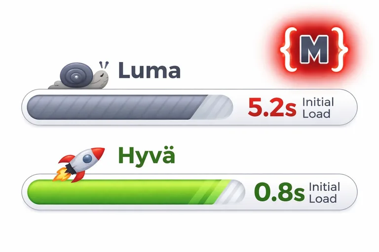
Imagine you've invested hundreds of euros in SEO, your Google and Meta ad campaigns are running perfectly, and your visitors are enthusiastically filling their carts. And then it happens: at the single most important point in the entire customer journey – checkout – over 70% of users abandon the process. Unfortunately, in the Magento world this phenomenon isn't the exception – it's often the standard. The classic Magento checkout (Luma) is technically bloated, visually complex, and agonizingly slow due to outdated JavaScript frameworks like Knockout.js.
As a specialized Magento developer at Mironsoft, I treat checkout as a high-precision clockwork. Every unnecessary field, every second of load time, and every missing trust signal is a grain of sand in the gears, ruining your conversion rate. In this comprehensive guide, you'll learn how Magento checkout optimization tears down the last barrier to purchase and turns your store into a highly efficient sales machine.

01
The Problem: Why Magento's Standard Checkout Kills Your Conversions
Magento 2 was designed as an enterprise system that has to do everything. Unfortunately, that shows in the standard checkout too. Technically, it's built on the so-called "Knockout.js" framework. That means every interaction, every address change, and every shipping method selection triggers complex, invisible processes in the browser that often cause delays.
The biggest conversion killers in the Magento standard are:
- Lack of speed: Initializing the checkout often takes several seconds. In an age where users expect instant response, that's fatal.
- Cognitive overload: Too many steps, too many form fields, and a confusing summary overwhelm the customer.
- Lack of mobile optimization: On smartphones, tiny input fields and hidden error messages are the surest path to abandonment.
- Forced registration: Customers hate having to create an account just to place a quick order.
”
At the single most important point in the entire customer journey – checkout – over 70% of users abandon the process.
02
The Technical Revolution: Hyvä Checkout and Magewire
At mironsoft, we've declared war on slow checkouts. The most important weapon in our arsenal is Hyvä Checkout. While the Luma checkout loads hundreds of JavaScript files, Hyvä relies on a modern architecture with Magewire (a PHP-driven framework for interactive interfaces) and Alpine.js.
The benefits for your store are groundbreaking:
- Lightning-fast load time: The checkout is ready to use almost instantly.
- Easy customization: As developers, we can change fields and layouts in a fraction of the time we'd need with Knockout.js.
- Improved stability: Less JavaScript complexity means fewer sources of error in the customer's browser.
03
Strategies for a High-Conversion Checkout
Successful checkout optimization follows clear UX principles. At mironsoft we implement the following strategies to minimize friction for your customers.
A. One-Step Checkout vs. Multi-Step Checkout
There's no blanket answer to what's better. A one-step checkout reduces the perceived distance to the goal, but can feel overwhelming with a very large number of data fields (e.g., in B2B). A multi-step checkout guides the user by the hand, but needs a progress bar to keep them motivated. We analyze your target audience and choose the model that converts best.
B. Form Field Reduction (Less Is More)
Every field you don't absolutely need for order processing should go. Do you really need a title/salutation? A phone number (except for freight carriers)? A second address line? We use smart logic like:
- Auto postcode lookup: The customer enters the ZIP code, and city and state fill in automatically.
- Google Places integration: Address suggestions appear as the customer types.
- Combined name field: First and last name in one field instead of two separate ones.
C. Guest Checkout as the Default
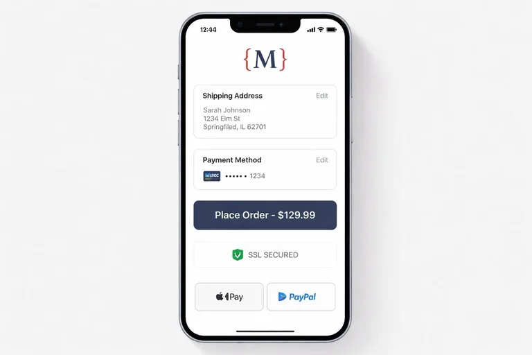
We make guest checkout as prominent as possible. We only offer the option to create an account after the order, on the "thank you" page – with the argument that the data is already there for shipment tracking anyway. That massively lowers the psychological barrier to entry.
04
Payment Integration: Removing Friction with Express Payment Methods
The moment a customer has to go dig out their credit card is the most dangerous moment for conversion. We integrate modern express checkout solutions:
- Apple Pay & Google Pay: One tap, Face ID, done. No address entry needed, since the data comes directly from the payment provider.
- PayPal Express: Enables purchase directly from the product page or cart, completely bypassing checkout.
- Klarna & buy on invoice: Especially essential in the German market, to build trust through "goods first, payment later."
05
Trust and Micro-Copy: Small Details with Big Impact
Customers often carry unconscious fears through checkout: "Is my payment secure?", "When will the package arrive?", "Is return shipping free?". We address these fears with targeted trust elements:
- Security seals: Trusted Shops, SSL encryption, and PCI compliance icons right in the viewport.
- Micro-copy: Small lines like "Don't worry, we won't send spam" beneath the email field, or "Free returns for 30 days" in the order summary.
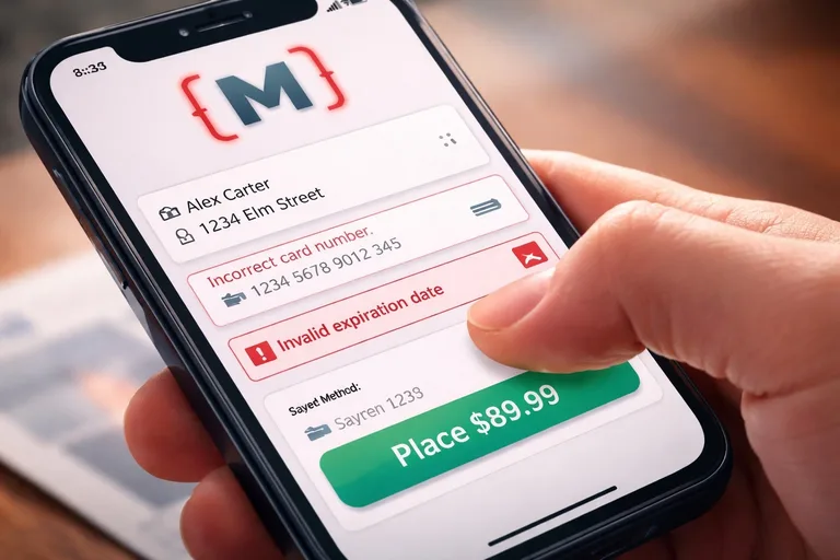
- Real-time validation: Error messages appear immediately when leaving a field, not only after clicking "order." Nothing is more frustrating than a page that reloads with five red errors after submission.
”
Stores without guest checkout lose up to 30% of their customers at the very last step.
06
B2B Special Requirements in Checkout
In B2B commerce, checkout often needs to offer additional functionality, which we implement with technical precision:
- Order to cost center: Fields for PO numbers or references.
- VAT ID validation: Real-time validation for tax-free intra-community deliveries.
- Custom delivery dates: Calendar integration for selecting a delivery window.
- Credit limit check: Automated verification of whether the company account still has room for a purchase on account.
07
Testing and Analysis: Data Beats Gut Feeling
Every store is different. What works for a fashion retailer might fail for a B2B spare-parts specialist. That's why our checkout optimization at mironsoft is data-driven:
- A/B testing: We test two versions of the checkout against each other (e.g., different button colors or field arrangements) and let real users decide which converts better.
- Funnel analysis (GA4): We track exactly which step most users abandon at. Is it address entry? Shipping selection? Or payment?
- Heatmaps & session recording: We review anonymized recordings to understand where users hesitate or "circle" with their mouse. These insights flow directly into the next optimization round.
08
Why mironsoft Is Your Expert for Checkout Performance
As a specialized Magento developer, I go beyond mere design. I understand the API architecture behind the cart, database locks under high order volume, and the pitfalls of payment module integration. With me, you get:
- Code excellence: No heavy plugins – lean, performant solutions (Hyvä-first).
- Holistic consulting: I treat logistics, payment, and UX as one unified system.
- Fast implementation: Through ready-made components and deep expertise, we lift your conversion rate in the shortest possible time.
Conclusion: Your Checkout Is Your Profit Center
Optimizing your Magento checkout is the most profitable technical measure you can take for your online store. While marketing costs per click keep rising, improving your close rate is an investment that pays for itself with every single order. At mironsoft we build checkouts that aren't just technically stable – they delight your customers and sustainably grow your revenue. Don't leave the most important moment of your customer journey to chance.
How many customers are you currently losing at checkout? Let's run a funnel analysis together and trim your store for high performance.
Request a Free Funnel AnalysisFrequently Asked Questions (FAQ) About Magento Checkout Optimization
Why is Magento 2's standard checkout so slow?
The standard checkout is built on the Knockout.js framework, which has to load a huge number of XML configurations and JavaScript files before the first interaction is even possible. Every time a value changes (e.g., the shipping method), the system recalculates complex dependencies in the background, which often causes noticeable delays. We solve this by using modern architectures like Hyvä Checkout, which reduces JavaScript bloat by up to 90%.
What's better: one-step checkout or multi-step checkout?
There's no universal answer, since both concepts have advantages and disadvantages. A one-step checkout often feels faster and more modern, but can look cluttered with a very large number of required fields. A multi-step checkout, on the other hand, guides the customer psychologically better through the process, but carries the risk of drop-off on every "next" click. We decide, based on your product data and a target-audience analysis, which model achieves the highest conversion rate for your store.
How important is guest checkout for conversion rate?
Guest checkout is one of the single most important levers there is. Many customers perceive forced registration as a barrier and fear spam or complicated data management. Statistics show that stores without guest checkout lose up to 30% of their customers at the very last step. We implement guest checkout as the default and only subtly offer account creation after the order is placed.
Can express payment methods like Apple Pay really reduce abandonment rate?
Yes, massively. Express payment methods eliminate the most tedious part of checkout: filling in address data and typing out credit card numbers. Since the shipping address is passed directly from the payment provider, the entire purchase process shrinks to a few seconds. Mobile users in particular, who often shop "on the go," appreciate this frictionlessness, which often doubles mobile conversion rate.
How should I handle error messages in the checkout form?
Error messages need to appear in real time (inline validation) and be phrased with absolute clarity. Nothing frustrates customers more than clicking the final button and getting a page back that has cleared all their input and vaguely says "there's an error in the data." We make sure fields turn green immediately when the input is correct, and give clear red hints on how to fix an error (e.g., missing "@" in the email address).
Why does my layout sometimes jump during checkout loading?
This is called Cumulative Layout Shift (CLS) and is a sign of poor technical optimization. In Magento it often happens when payment modules or shipping widgets load with a delay and push the rest of the page downward. We fix this by using placeholders (skeletons) and fixed container sizes, so visual stability is maintained and the customer doesn't accidentally click the wrong element.
Can checkout also be specifically optimized for mobile users?
Absolutely! A mobile checkout requires large "touch targets" for thumb operation, doing away with unnecessary hover effects, and automatically activating the right keyboard (e.g., a numeric pad for the postal code). We also implement "sticky" elements, like the total price and buy button, so they stay in the user's view while scrolling, increasing confidence at the point of purchase.
What is a "post-purchase" checkout experience?
The experience doesn't end when the customer clicks "buy." The "thank you" page holds enormous potential for upselling, newsletter sign-ups, or inviting the customer to create an account. We optimize this page so it gives customers a strong sense of confirmation and anticipation, while simultaneously collecting valuable data for your marketing – without ever burdening the actual purchase process beforehand.
How do I handle high shipping costs that only get shown late?
Unexpected costs are the number one reason for checkout abandonment. We recommend communicating shipping costs as transparently and as early as possible (already in the cart). Technically, we solve this with "shipping estimators" based on the user's country. Where possible, a "free shipping over X" notice right in checkout is a strong psychological trigger that can even boost cart value shortly before completion.
Do security badges really influence customer trust?
Yes, especially for first-time buyers who don't yet trust your brand 100%. Recognized logos like Trusted Shops, Norton Secured, or your payment providers' logos act as "social proof" and reduce fear of fraud. We strategically place these badges near the buy button or the sensitive credit card entry, to boost psychological safety at the decisive moment.
Should I hide the main navigation during checkout?
Yes, in most cases a "distracted" checkout is deadly for conversion. We typically remove the main navigation, search, and other disruptive elements during checkout (distraction-free checkout). The user should focus entirely on completing the purchase. A small link back to the cart or the logo linking to the homepage is more than enough to leave the customer in control, without inviting them to leave.
Can mironsoft optimize my existing Luma checkout?
We can make targeted improvements to Luma (e.g., CSS adjustments or removing unused fields), but we quickly hit economic limits due to Knockout.js's outdated architecture. In 90% of cases, switching to a modern Hyvä Checkout is the more sustainable and significantly more performant solution, and it usually pays for itself in full within a few months through higher revenue.
How do we handle B2B customers during optimization?
B2B checkouts often require additional data like cost centers, order numbers, or VAT IDs. We implement logic that only shows these fields when a business customer is logged in. We also integrate features for credit limit checks or custom delivery windows. The focus here is less on emotional design and more on maximum process efficiency for the professional buyer.
How do I track the success of my checkout optimization?
We use Google Analytics 4 (Enhanced E-Commerce Tracking) to measure every single step of the checkout funnel. That way, we see exactly where users leave the process. On top of that, we deploy tools like Hotjar or Microsoft Clarity to understand real user behavior through heatmaps and session recordings. Only what gets measured can be optimized precisely – we give you the data foundation for your decisions.
How do I get my checkout optimization project started with mironsoft?
It starts with a checkout audit. We analyze your current process, measure load times, and identify the biggest friction points. From there, we build a prioritized list of measures – from quick fixes to a complete technological upgrade. Just send us a message or give us a call – we'll get your checkout fit for maximum revenue!
Cookie-Details
| Name | Anbieter | Laufzeit | Zweck |
|---|---|---|---|
Cookie-Details
| Name | Anbieter | Laufzeit | Zweck |
|---|---|---|---|
Cookie-Details
| Name | Anbieter | Laufzeit | Zweck |
|---|---|---|---|
Cookie-Details
| Name | Anbieter | Laufzeit | Zweck |
|---|---|---|---|