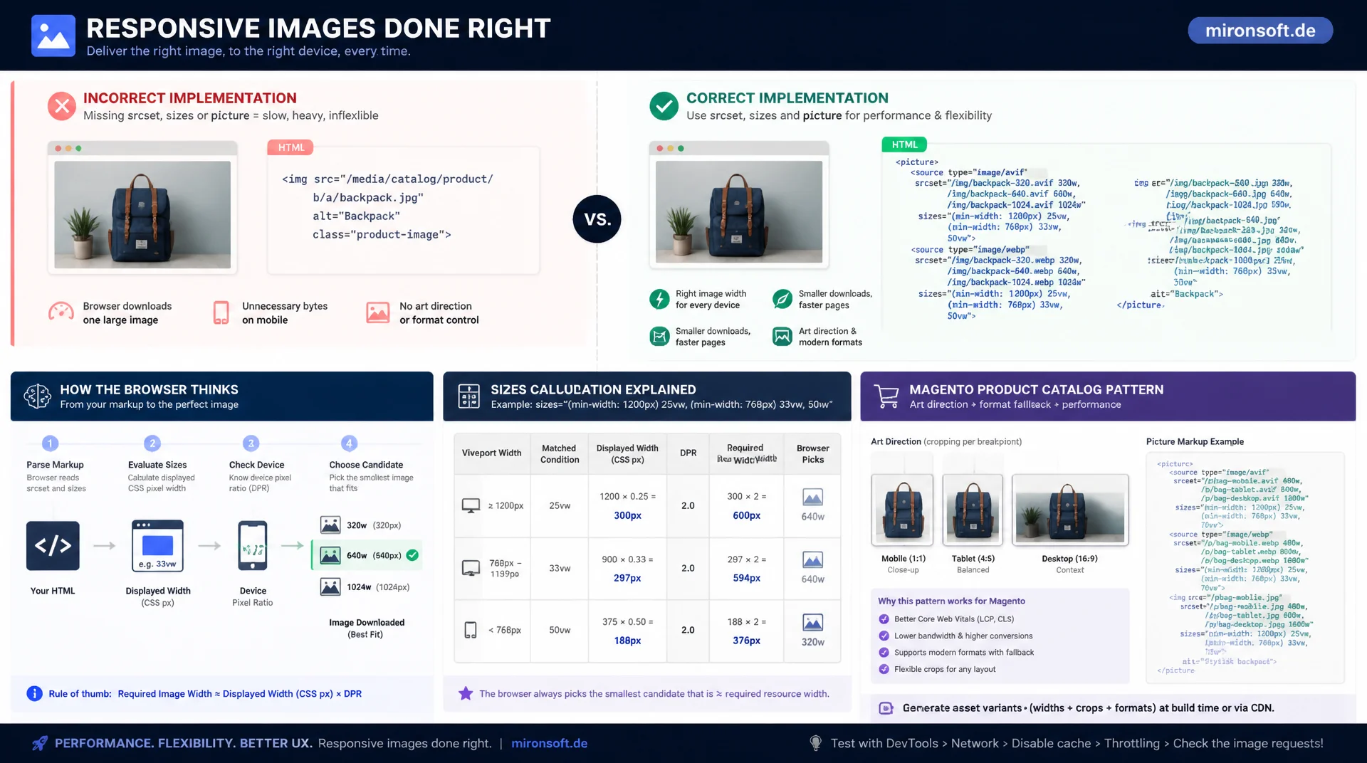
How browsers actually decide which image to load
Most responsive image setups ship images that are too large or too small because srcset, sizes and picture are combined incorrectly or left incomplete. This article explains the actual browser logic behind width and density descriptors, shows the correct sizes calculation, and delivers a practical pattern for Magento product catalogs with art direction and format fallback.
Table of Contents
- 1. srcset with Width Descriptors (w): Telling the Browser the Image Size
- 2. srcset with Pixel Density Descriptors (x): Fixed Elements at High Resolution
- 3. The sizes Attribute: How the Browser Calculates the Right Source
- 4. The picture Element for Art Direction: Different Crops per Breakpoint
- 5. The picture Element for Format Fallback: AVIF, WebP, JPEG
- 6. Generating the Right Image Variants for a Magento Product Catalog
- 7. The Most Common Mistake: Missing sizes and Worst-Case Selection
- 8. Lazy Loading Interplay with srcset and sizes
- 9. Responsive Image Patterns Compared Head to Head
- 10. Summary
- 11. FAQ
1. srcset with Width Descriptors (w): Telling the Browser the Image Size
The w descriptor in srcset does not describe an image's display size, but its actual intrinsic pixel width in the file. An entry like image-800.jpg 800w tells the browser: this file is 800 pixels wide, regardless of how large it will later be rendered on screen. That is the key difference from pixel density descriptors, which reference a CSS pixel ratio instead. Width descriptors suit images whose display size varies with the viewport or grid layout, such as product images in a responsive grid that shows two, three, or four columns depending on screen width.
For the browser to make a sensible choice among multiple w candidates, it also needs the sizes attribute, which describes the actual display width. Without sizes, the browser assumes the image fills the entire viewport width, which in a four-column grid leads to a massive over-selection. Combining several w values with a matching sizes attribute is therefore not an optional detail, it is the basic requirement for width descriptors to work correctly at all.
In practice, a grid image typically gets four to six generated widths, oriented around the relevant breakpoints rather than arbitrary powers of two. A jump from 400 to 1600 pixels covers the range between mobile grid and large desktop grid, including retina displays, without maintaining an unnecessary number of variants.
<!-- Product grid image: width descriptors + sizes matching the actual grid layout -->
<img
  src="/media/catalog/product/cache/large/sample-product.jpg"
  srcset="
    /media/catalog/product/cache/400/sample-product.jpg 400w,
    /media/catalog/product/cache/800/sample-product.jpg 800w,
    /media/catalog/product/cache/1200/sample-product.jpg 1200w,
    /media/catalog/product/cache/1600/sample-product.jpg 1600w
  "
  sizes="(min-width: 1024px) 33vw, (min-width: 640px) 50vw, 100vw"
  width="1200"
  height="1200"
  alt="Product name"
  loading="lazy"
>
2. srcset with Pixel Density Descriptors (x): Fixed Elements at High Resolution
The x descriptor is the older, simpler variant of srcset and suits elements whose display size is fixed and does not change with the layout, such as a logo, an icon, or an avatar image at a constant pixel size. Instead of the intrinsic width, x gives the ratio to the nominal CSS size: logo@2x.png 2x means this file is intended for devices with a device pixel ratio of 2. The browser compares only the device's devicePixelRatio against the available descriptors and completely ignores the viewport width in the process.
A key advantage of x descriptors is that they need no sizes attribute, because no layout calculation takes place. That makes them simpler to maintain, but also less flexible. As soon as an element's display size changes with the viewport, for example a hero icon that is smaller on mobile than on desktop, x is the wrong choice. The browser would keep optimizing only for pixel density, not layout size, and in many cases would then deliver an image that is too small or too large for the given context.
A practical rule of thumb: use x for images with a fixed CSS size such as logos and badges, and w plus sizes for anything that scales fluidly with the layout, which in a Magento shop is essentially every product image, hero image, and content image.
<!-- Fixed-size logo: pixel-density descriptors, no sizes attribute needed -->
<img
  src="/media/logo/brand-logo.png"
  srcset="
    /media/logo/brand-logo.png 1x,
    /media/logo/brand-logo@2x.png 2x,
    /media/logo/brand-logo@3x.png 3x
  "
  width="160"
  height="48"
  alt="Brand logo"
>
3. The sizes Attribute: How the Browser Calculates the Right Source
The sizes attribute is a list of media condition/value pairs describing how wide the image is actually displayed under various viewport conditions, for example (min-width: 1024px) 33vw, 100vw. Importantly, the browser evaluates sizes during HTML parsing, long before CSS is fully applied and the final layout is calculated. That means sizes has to predict the layout width, not measure it. In complex CSS Grid or Flexbox layouts with a variable column count, this is a deliberate approximation, not an exact calculation.
The actual selection algorithm runs in three steps: first, the browser determines the first matching media condition from the sizes list and its value, for example 50vw at a viewport width of 900 pixels. Second, it multiplies this value by the current viewport width and the device's devicePixelRatio, which yields the effective target width in physical pixels. Third, it selects the smallest candidate from the w values in srcset that still meets or exceeds this target width. If no candidate is large enough, the largest available one is used.
A frequently overlooked point: Chrome, Firefox and Safari are allowed by the specification to apply additional heuristics, for example deliberately choosing a smaller variant on a slow network connection (Save-Data header, Chrome Lite Mode). The sizes calculation therefore delivers a target size, not a guarantee of exactly that file.
4. The picture Element for Art Direction: Different Crops per Breakpoint
While srcset and sizes always deliver the same image composition at different resolutions, the picture element solves a different problem: different crops or aspect ratios depending on the viewport, known as art direction. A typical example is a campaign hero that shows a wide panoramic image on desktop, a square crop on tablet, and a portrait-format crop with the subject in focus on mobile. This is not a scaling problem but a composition problem, which srcset alone cannot solve because there the same image file only exists at different sizes.
The browser evaluates the <source> elements in document order and uses the first source whose media condition matches. The <img> element at the end is not optional: it provides the fallback image for browsers without picture support and, at the same time, defines all shared attributes such as alt, width, height and loading. Each <source> can additionally carry its own srcset with multiple resolution variants, so art direction and scaling can be combined.
<!-- Art direction: different crop per breakpoint, not just different resolution -->
<picture>
  <source media="(min-width: 1024px)" srcset="/media/wysiwyg/hero-wide.jpg">
  <source media="(min-width: 640px)" srcset="/media/wysiwyg/hero-square.jpg">
  <img
    src="/media/wysiwyg/hero-portrait.jpg"
    alt="Campaign hero"
    width="800"
    height="1000"
    fetchpriority="high"
  >
</picture>
5. The picture Element for Format Fallback: AVIF, WebP, JPEG
The second major use case for picture is format fallback: offering modern, more efficient image formats such as AVIF or WebP without excluding older browsers or clients that lack support. Instead of the media condition, this uses the type attribute on each <source>, for example type="image/avif". The browser checks each source in order for format support and loads the first one it can decode. AVIF often achieves 30 to 50 percent smaller file sizes than JPEG at comparable visual quality, WebP usually sits in between, and JPEG remains the universal fallback at the end of the list.
It is important that each format source carries its own srcset with multiple widths, and ideally its own sizes too, otherwise the format optimization comes at the expense of the size optimization. In Magento shops this can be automated via the media storage adapter, which generates and caches AVIF and WebP variants at the same width tiers alongside the JPEG originals on image upload. If one of these variants is missing, the browser automatically falls back to the next source without any visible error.
<!-- Format fallback: AVIF first, then WebP, then JPEG as universal fallback -->
<picture>
  <source
    type="image/avif"
    srcset="
      /media/catalog/product/cache/800/sample.avif 800w,
      /media/catalog/product/cache/1600/sample.avif 1600w
    "
    sizes="(min-width: 1024px) 33vw, 100vw"
  >
  <source
    type="image/webp"
    srcset="
      /media/catalog/product/cache/800/sample.webp 800w,
      /media/catalog/product/cache/1600/sample.webp 1600w
    "
    sizes="(min-width: 1024px) 33vw, 100vw"
  >
  <img
    src="/media/catalog/product/cache/800/sample.jpg"
    width="800"
    height="800"
    alt="Product name"
    loading="lazy"
  >
</picture>
6. Generating the Right Image Variants for a Magento Product Catalog
A Magento product catalog with several thousand items poses a particular challenge: for every product image, multiple widths and ideally multiple formats need to be maintained, without letting storage and cache warm-up time explode. The pragmatic approach is to orient the widths around the layout breakpoints that actually occur: product listing images in a 2 to 4 column grid, gallery images on the product detail page, and thumbnails in the mini cart each need different width tiers, because their sizes values differ fundamentally.
Instead of computing image variants on the fly for every request, they are generated once during product import or media upload and cached in the pub/media/catalog/product/cache directory, addressed via a cache key built from image path and width. A sensible set for product listing images is [280, 400, 560, 800, 1200], and for gallery images on the detail page rather [600, 900, 1200, 1800]. These values are not guessed, but derived from the theme's actual Tailwind breakpoints and grid column counts.
The following excerpt shows the basic pattern for a Hyvä phtml template that assembles srcset dynamically from a list of widths instead of hard-coding every variant.
<?php
/** @var \Magento\Catalog\Block\Product\ListProduct $block */
/** @var \Magento\Framework\Escaper $escaper */
$widths = [280, 400, 560, 800, 1200];
$srcset = implode(', ', array_map(
    static fn (int $w): string => "{{\$block->getProductImageUrl(\$product, $w)}} {$w}w",
    $widths
));
?>
<img
    src="{{$block->getProductImageUrl($product, 400)}}"
    srcset="<?= $escaper->escapeHtmlAttr($srcset) ?>"
    sizes="(min-width: 1280px) 25vw, (min-width: 768px) 33vw, 50vw"
    width="400"
    height="400"
    alt="{{$escaper->escapeHtmlAttr($product->getName())}}"
    loading="lazy"
>
7. The Most Common Mistake: Missing sizes and Worst-Case Selection
By far the most common mistake in responsive image implementations is a srcset with multiple w candidates without an accompanying sizes attribute. If sizes is missing, the specification falls back to a default value: sizes="100vw". The browser then assumes the image is displayed at the full viewport width, even if it actually only fills a 25 percent column in a four-column grid. The result is the worst-case selection: on a 1600 pixel wide desktop viewport, the browser loads the largest available variant even though the image is only visually rendered at 400 pixels wide, an overhead of several hundred kilobytes per image, multiplied by every product in the grid.
This mistake is particularly insidious because it does not immediately look like a bug in DevTools, the image loads correctly and looks sharp. It only becomes visible via the network table, when you compare the actually transferred file size against the element's rendered CSS size, or via the Lighthouse audit "Properly size images", which surfaces exactly this discrepancy. The rule is simple: as soon as srcset contains more than one w candidate, sizes is mandatory and must be kept up to date with every layout change to the grid.
8. Lazy Loading Interplay with srcset and sizes
The native loading="lazy" attribute operates completely independently of srcset and sizes, the two mechanisms apply one after another: first, loading decides when the browser even starts requesting an image source, then srcset and sizes decide which source that is. For images below the visible area, loading="lazy" on every img and every source inside a picture makes sense and noticeably reduces initial network load, especially on long category pages with many product images.
For the single largest, immediately visible element, usually the page's LCP image, the opposite applies: loading="lazy" must not be set here, because the browser would then only start loading after the layout scan instead of kicking it off immediately with high priority. Combined with fetchpriority="high" and a <link rel="preload"> in the head, the LCP image can be loaded ahead of all other images in a targeted way. A common mistake is applying the same lazy-loading rule uniformly to every image in a template instead of distinguishing between the critical first image and all subsequent images.
9. Responsive Image Patterns Compared Head to Head
The following overview compares the most common mistakes with responsive images against the correct patterns, along with the concrete effect on load time and image quality.
| Scenario | Flawed Pattern | Correct Pattern | Effect |
|---|---|---|---|
| srcset without sizes | srcset with multiple w, no sizes |
Add sizes matching the grid layout |
Prevents worst-case selection (default 100vw) |
| Fluid grid image | Only x descriptors (1x, 2x) |
w descriptors + sizes |
Accounts for variable layout width, not just DPR |
| Pure resolution choice | picture for simple size variants |
img with srcset is enough |
Less markup, same function |
| Missing dimensions | No width/height |
width/height on every img |
Reserves space, prevents layout shifts (CLS) |
| Number of variants | A single, very large file for all widths | Generate 4-6 width tiers per image type | Smaller transfer size on mobile and tablet |
The table shows a consistent pattern: almost every responsive image mistake stems from a piece of information the browser needs for the selection either being missing or not matching the actual layout. Anyone who consistently derives sizes from the real CSS breakpoints and reserves picture exclusively for art direction and format fallback automatically avoids the vast majority of these problems.
Mironsoft
Image optimization, media pipelines and web performance for Magento shops
Responsive images implemented properly, not guessed?
We analyze how your Magento shop delivers images, build a matching srcset/sizes strategy, and set up format fallbacks with AVIF and WebP across your entire product catalog.
Image Audit
Analysis of the current srcset/sizes selection against the real layout
Variant Pipeline
Automated generation of width tiers and AVIF/WebP variants
Hyvä Integration
picture and srcset templates for the product grid, PDP and hero banners
10. Summary
Responsive images solve an optimization problem, not a layout question: they ensure that every device loads exactly the image file it needs for the actual display size, no more and no less. srcset with w descriptors plus a precise sizes attribute covers the vast majority of cases, from product grids to content images. x descriptors remain reserved for elements with a fixed display size, such as logos. The picture element is not a replacement for srcset, but complements it specifically where either the image composition (art direction) or the file format (AVIF/WebP/JPEG) needs to differ by context.
The biggest lever is treating sizes as anything but an afterthought, consistently deriving it from the theme's actual CSS breakpoints and updating it with every layout change. For Magento product catalogs, an automated variant pipeline that generates fixed width tiers per image type on media upload pays off, instead of maintaining image sizes manually or leaving the browser to fall back to the worst-case selection because sizes is missing.
Responsive Images in Detail - The Key Takeaways
w vs. x
w descriptors for fluid layout images with sizes, x descriptors only for elements with a fixed display size.
sizes is mandatory
Without sizes, the default 100vw applies, which in grid layouts almost always leads to the worst-case selection.
Use picture deliberately
Only for art direction (different crops) and format fallback (AVIF/WebP/JPEG), not for pure size selection.
Automate variants
Generate 4-6 width tiers per image type on media upload, never lazy-load the LCP image.