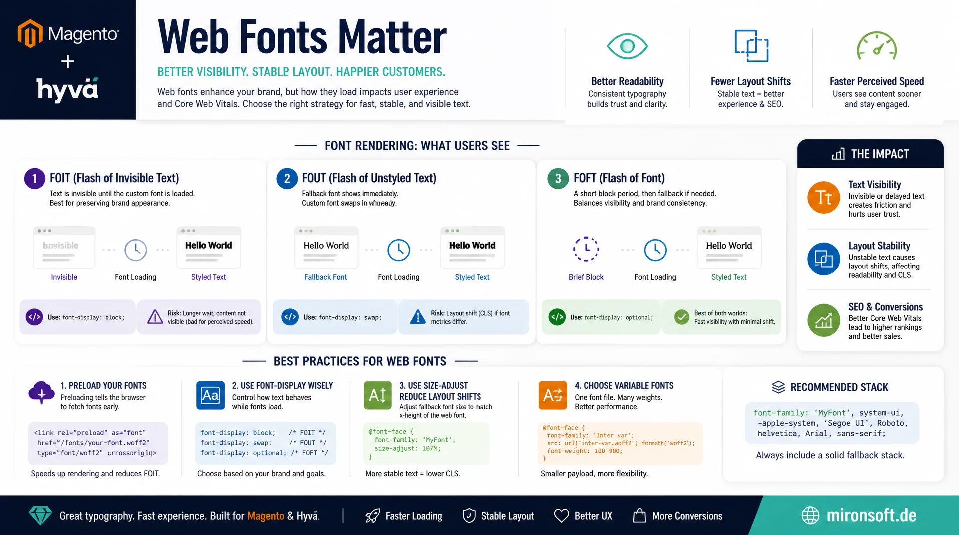
FOIT, FOUT, FOFT, and getting font-display right
Web fonts are one of the most common causes of invisible text and jarring layout shifts. This article explains the rendering mechanics behind FOIT, FOUT, and FOFT, shows how font-display, preloading, variable fonts, and size-adjust work together, and makes font loading in Magento and Hyvä stores technically clean and measurably stable.
Table of Contents
- 1. Why font loading is a rendering decision
- 2. FOIT, FOUT, and FOFT in detail
- 3. font-display: auto, block, swap, fallback, optional
- 4. Preloading critical fonts deliberately
- 5. Variable fonts to reduce file count
- 6. size-adjust, ascent-override, and descent-override
- 7. Self-hosting vs. font CDN
- 8. The Font Loading API and document.fonts.ready
- 9. font-display values compared side by side
- 10. Summary
- 11. FAQ
1. Why font loading is a rendering decision
Web fonts are not shipped automatically with the HTML but loaded as a separate resource, and in the meantime the browser has to decide what to do with text whose target typeface isn't yet available. That decision is not a minor detail; it is one of the few places where the browser's rendering behavior is directly configurable. If you don't know the options, you leave the decision to whatever default the browser engine happens to ship, and those defaults differ across engines.
This is especially relevant for Magento and Hyvä stores, where product pages often load several font weights at once: regular for body copy, bold for prices and headlines, sometimes a separate icon font. Each of these files goes through the same lifecycle of request, download, and render permission. Without deliberate control via font-display and preloading, this adds up to noticeable delays in text visibility and unexpected layout jumps once the real font replaces the fallback.
2. FOIT, FOUT, and FOFT in detail
FOIT (Flash of Invisible Text) describes the behavior where the browser keeps text invisible until the web font file has fully loaded. This was Chrome's default for a long time and leads to an empty viewport on slow connections, even though the text is technically already in the DOM. FOUT (Flash of Unstyled Text) is the opposite: the browser renders immediately with a fallback font and swaps it once the target font is available. Text is always readable, but a visible jump can occur if the fallback and target fonts have different advance widths.
FOFT (Flash of Faux Text) is a third, less common strategy: a reduced version of the target font is loaded first, often only the regular weight, while bold or italic are synthesized client-side. Once the full weights arrive, the browser replaces the synthesized variants with the real ones. FOFT reduces the initial download size, but at the cost of potentially two visible swaps instead of one. In practice, swap combined with well-matched fallback metrics is the most robust compromise between visibility and visual stability for most Magento stores.
3. font-display: auto, block, swap, fallback, optional
The CSS font-display property in an @font-face declaration controls exactly this behavior declaratively, without JavaScript. It defines two time windows: the block period, during which text stays invisible if the font hasn't loaded yet, and the swap period, during which the browser renders with the fallback font and swaps it in once ready. After both windows expire, the browser permanently uses either the target font or the fallback font, depending on the value.
auto leaves the decision to the browser and is therefore unpredictable. block forces a short block period (typically 3 seconds) followed by an unlimited swap period, which caps FOIT to a short duration. swap sets the block period to effectively zero and renders immediately with fallback, producing FOUT, and is the right default for most content pages. fallback allows only a very short block window (about 100ms) and a short swap window (about 3s), after which the fallback font stays fixed permanently if the target font arrives too late. optional goes even further: no block window, a minimal swap window, and the browser is allowed to abort the download entirely under a slow connection and permanently use the fallback font, ideal for load time under network pressure with zero CLS contribution.
/* font-display declaratively controls the block and swap time windows */
@font-face {
  font-family: "Inter";
  src: url("/fonts/inter-regular.woff2") format("woff2");
  font-weight: 400;
  font-display: swap; /* immediate fallback render, swap when ready */
}

@font-face {
  font-family: "Inter";
  src: url("/fonts/inter-bold.woff2") format("woff2");
  font-weight: 700;
  font-display: swap;
}

/* Non-critical icon font: no layout impact if it never loads */
@font-face {
  font-family: "ShopIcons";
  src: url("/fonts/shop-icons.woff2") format("woff2");
  font-display: optional; /* skip download entirely on slow connections */
}

body {
  font-family: "Inter", system-ui, -apple-system, sans-serif;
}
4. Preloading critical fonts deliberately
The browser only discovers @font-face declarations once the CSS has been parsed, and it usually starts the font download only after that, once it hits an element that actually needs the font. This late discovery point is the main reason for visible FOUT even on fast connections. A <link rel="preload" as="font"> in the document head breaks this chain: the browser fetches the file in parallel with the CSS, without waiting for it to parse, often cutting the time to the target font by several hundred milliseconds.
It's important to restrict preloading to the font weights actually visible above the fold; preloading a bold variant that's only used in the footer wastes bandwidth that more critical resources need. The crossorigin attribute is mandatory for font preloads, even for same-origin requests, since fonts are always loaded in CORS mode per spec; omit it, and the browser fetches the file a second time when it's actually used.
<!-- Preload only the above-the-fold font weights, crossorigin is mandatory -->
<link rel="preload" as="font" type="font/woff2"
      href="/fonts/inter-regular.woff2" crossorigin>
<link rel="preload" as="font" type="font/woff2"
      href="/fonts/inter-bold.woff2" crossorigin>

<!-- Hyvä phtml: preload the variable font used for hero and product title -->
<link rel="preload" as="font" type="font/woff2"
      href="{{$block->getViewFileUrl('fonts/inter-var.woff2')}}" crossorigin>

<style>
  /* CSS declared after preload so the browser already has the bytes cached */
  @font-face {
    font-family: "Inter";
    src: url("/fonts/inter-var.woff2") format("woff2-variations");
    font-weight: 400 700;
    font-display: swap;
  }
</style>
5. Variable fonts to reduce file count
Classic web font setups load a separate file per weight and style: regular, bold, italic, bold italic, often across multiple weights. For a store with four to six weights, that quickly adds up to 300-500 KB of font data, all of it competing for the critical rendering path. Variable fonts encode the entire weight range, and sometimes width and italics too, into a single file with interpolatable axes. Instead of five separate 60 KB files, the browser loads a single file of often only 80-120 KB that covers every weight between 100 and 900.
The effect on font loading is doubly positive: fewer HTTP requests mean less connection-setup overhead, and because only one file needs to load, only one preload link is needed instead of several. On the CSS side, the weight range is declared as a range via font-weight: 400 700, and the running stylesheet can then use any intermediate value like font-weight: 550, which would be impossible with static fonts. The trade-off: variable fonts are larger per file than a single static weight, so switching pays off once several weights are actually in use.
/* One variable font file covers the entire weight axis 100-900 */
@font-face {
  font-family: "Inter Var";
  src: url("/fonts/inter-var.woff2") format("woff2-variations");
  font-weight: 100 900;
  font-stretch: 75% 125%;
  font-display: swap;
}

/* Any intermediate weight is now usable without extra files */
.product-price {
  font-family: "Inter Var", system-ui, sans-serif;
  font-weight: 650;
}

.hero-headline {
  font-family: "Inter Var", system-ui, sans-serif;
  font-weight: 780;
}
6. size-adjust, ascent-override, and descent-override
Even with perfect font-display: swap, one problem remains: the fallback and target fonts almost never share identical metrics. Different x-height, advance width, and line height cause text to shift its line breaks during the font swap, pushing subsequent elements up or down, measured as Cumulative Layout Shift. The CSS descriptors size-adjust, ascent-override, descent-override, and line-gap-override in @font-face solve exactly this problem by adjusting a fallback font's metrics to approximate the target font as closely as possible.
The practical workflow: for the target font, say Inter, you pick a matching system fallback like Arial and analyze via a tool such as fontaine or the Capsize metric calculator how much its ascent, descent, and character width deviate. The calculated percentages are then defined as a separate @font-face rule for the fallback font and placed in the font-family stack directly before the target font. The result: the fallback text during the swap window already occupies nearly the same amount of space as the final text, so the layout jump on font swap practically disappears.
/* Target font */
@font-face {
  font-family: "Inter";
  src: url("/fonts/inter-var.woff2") format("woff2-variations");
  font-weight: 100 900;
  font-display: swap;
}

/* Metric-matched fallback: Arial adjusted to mimic Inter's box model */
@font-face {
  font-family: "Inter Fallback";
  src: local("Arial");
  size-adjust: 107.4%;
  ascent-override: 90.2%;
  descent-override: 22.8%;
  line-gap-override: 0%;
}

body {
  /* Fallback renders at near-identical width during the swap window */
  font-family: "Inter", "Inter Fallback", system-ui, sans-serif;
}
7. Self-hosting vs. font CDN
Google Fonts and similar font CDNs offer convenient <link> integration, but they force an extra DNS lookup, TCP handshake, and TLS handshake to a third-party domain before the actual font download even starts, typically 100-300ms of extra latency on mobile connections. Since browsers introduced cache partitioning across domains, the older advantage of a user already having the Google Fonts file cached from another site no longer holds. For GDPR-relevant stores in the EU, directly embedding Google Fonts URLs is also considered problematic for data protection, since it transmits the visitor's IP address to Google.
Self-hosting solves both problems: the font files live on the same domain or CDN as the rest of the store, eliminating the extra connection setup and making preload hints work reliably, since rel="preconnect" to a third-party font domain is no longer needed. In Magento, fonts can simply be placed in the theme directory under web/fonts and referenced via getViewFileUrl(), so they're automatically versioned by setup:static-content:deploy and served through the store's own CDN with long cache headers. The only downside of self-hosting is the manual maintenance overhead when fonts get updated, which a simple build script in the theme repository can automate almost entirely.
8. The Font Loading API and document.fonts.ready
For cases where CSS alone isn't enough, such as synchronizing a loading animation precisely with font rendering or smoothly fading in a FOUT transition, the browser exposes the CSS Font Loading API via the global document.fonts object. It lets you query the load state of individual font faces programmatically and wait for all referenced fonts to finish loading, without relying on unreliable timeout heuristics.
A common pattern is to add a class like fonts-loading to the <html> element before loading, which enforces an understated fallback appearance via CSS, and to swap that class for fonts-loaded only after document.fonts.ready resolves. This enables a soft opacity transition for the font swap that reads as less abrupt than a hard jump, without replacing the native font-display: swap mechanism. It's important to use this pattern only additively, since the native browser fallback still has to apply when JavaScript is disabled.
// Wait for all referenced fonts to finish loading, then swap a CSS class
document.documentElement.classList.add('fonts-loading');

document.fonts.ready.then(() => {
  document.documentElement.classList.remove('fonts-loading');
  document.documentElement.classList.add('fonts-loaded');
});

// Check a specific font-face without waiting for the whole document
document.fonts.load('700 1em "Inter"').then((loadedFaces) => {
  if (loadedFaces.length > 0) {
    console.log('Bold Inter is available for rendering');
  }
});

// React to individual font load events for fine-grained control
document.fonts.addEventListener('loadingdone', (event) => {
  event.fontfaces.forEach((face) => {
    console.log(`Loaded: ${face.family} ${face.weight}`);
  });
});
9. font-display values compared side by side
Each font-display value strikes a different balance between text visibility, visual stability, and control over the brand typeface. The table below summarizes when each value is the right choice.
| Value | Block window | Behavior | Recommendation |
|---|---|---|---|
| auto | Browser-dependent | Unpredictable, often FOIT in Chrome | Avoid |
| block | ~3 s | Short FOIT, then unlimited swap | Only defensible for icon fonts |
| swap | ~0 ms | Immediate FOUT, text always visible | Default for body copy |
| fallback | ~100 ms | Short swap window, then fallback fixed | Good compromise for brand fonts |
| optional | 0 ms | Download can be aborted, no CLS | Ideal for non-essential fonts |
In practice, these values can be combined: swap for the primary font that carries the brand identity, and optional for decorative or secondary weights that carry no critical information. Together with preloading, variable fonts, and metric-matched fallbacks, this produces a font-loading strategy that produces neither invisible text nor disruptive layout shifts.
Mironsoft
Font-loading engineering and rendering performance for Magento and Hyvä stores
Ready to fix font loading without layout shift?
We analyze your current font-loading strategy, migrate to self-hosting with variable fonts, and set up metric-matched fallbacks so text is visible immediately and the font swap produces zero CLS.
Font audit
Analysis of every loaded font weight, file size, and font-display value
Self-hosting migration
Moving off font CDNs to performant, GDPR-compliant self-hosting
Variable font integration
Consolidating multiple weights into a single, optimized font file
10. Summary
Font loading without layout shift starts with understanding the three basic patterns FOIT, FOUT, and FOFT, and deciding which one makes sense for which font weight. font-display: swap is the right baseline for most text content, optional suits non-essential fonts, and a deliberately placed <link rel="preload"> noticeably shortens the time to the target font, because the download no longer waits for the CSS to be parsed first.
Variable fonts drastically reduce the number of files that need to load and thereby simplify preloading too, while size-adjust, ascent-override, and descent-override eliminate the actual layout shift at font swap by matching the fallback font's metrics to the target font. Self-hosting removes extra latency from third-party domains and reduces privacy risk compared to font CDNs. Combined, this produces a loading strategy where text is visible from the first second and the font swap no longer produces a noticeable jump.
Font Loading Without Layout Shift - The Essentials at a Glance
Choose font-display deliberately
swap for body copy, optional for non-essential fonts, avoid auto.
Preload critical fonts
<link rel="preload" as="font"> with crossorigin, above-the-fold only.
Use variable fonts
One file instead of many weights, fewer requests, simpler preloading.
Match fallback metrics
size-adjust, ascent-override, descent-override against font-swap CLS.