States, focus and animation wired up correctly
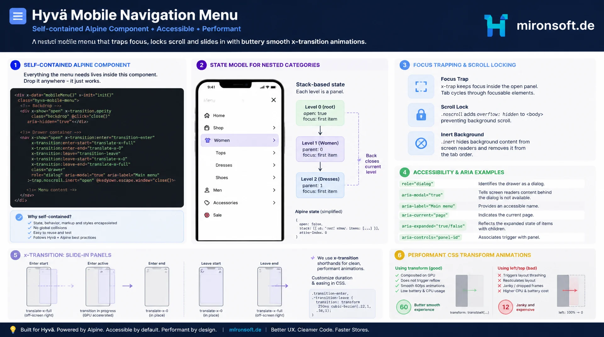
A mobile navigation that only toggles visibility is not enough: without a state model for nested categories, without a focus trap and without scroll lock, the off-canvas menu quickly becomes a dead end for keyboard and screen reader users. This article shows how to build the mobile navigation of a Hyvä theme as a self-contained Alpine component, with a state stack for category levels, x-transition for the slide-in panel, a focus trap, ARIA attributes and performant CSS transform animation instead of layout thrashing.
Table of Contents
- 1. Why mobile navigation needs its own Alpine component
- 2. The state model: open, active level and category stack
- 3. x-show and x-transition for the panel and backdrop
- 4. Focus trap and Escape handling for keyboard users
- 5. Body scroll lock while the mobile navigation is open
- 6. ARIA attributes: aria-expanded, aria-hidden and role=dialog
- 7. Rendering nested category trees recursively in phtml
- 8. Performance: transform instead of top/left, will-change with care
- 9. Luma jQuery menu vs. mobile navigation as an Alpine component
- 10. Summary
- 11. FAQ
1. Why mobile navigation needs its own Alpine component
In most Magento shops, the mobile navigation is the single most used interaction on smartphones, ahead of even product search. Despite that, it is often treated as a side effect of the desktop header in many implementations: a hamburger icon, an x-show, done. That covers plain visibility but ignores the actual complexity: nested category trees, keyboard operability, screen reader compatibility, and what happens to state when navigating back through several levels. A mobile navigation component built with Alpine encapsulates exactly that logic in one place instead of spreading it across multiple templates and ad hoc classes.
In Hyvä, Alpine.js fully replaces the Knockout.js widget system used by Luma. For the mobile navigation, that means no UI component overhead, no observable chains, just a single Alpine.data object that bundles state, transitions and behavior of the off-canvas navigation. This component is typically initialized in header.phtml or a dedicated navigation.phtml and bound to the menu's root element via x-data.
One scoping note: this article is not about generic Alpine component architecture, not about modal dialogs, and not about the store or currency switcher. It is specifically about the slide-in menu with a category tree, as needed in nearly every Hyvä theme to replace the Luma hamburger menu. The following sections build the component piece by piece, from the state model to the performant animation.
2. The state model: open, active level and category stack
The core of any mobile navigation component built with Alpine is a clean state model. Besides the simple open boolean for visible/hidden, the component needs a structure that reflects which category level the user is currently on and how a back button returns them one level up. The proven solution is a stack, an array of category IDs, that appends an ID every time the user drills deeper and removes the last ID (pop) when navigating back. The last ID on the stack determines which subcategory list is currently displayed.
Compared to nested booleans, this pattern has a decisive advantage: the depth of the category tree can be arbitrary without a dedicated flag per level. An x-for over the stack also gives you a breadcrumb display essentially for free. The state lives centrally in an Alpine.data object, registered via Alpine.data('mobileNav', () => ({...})) and wired into the markup with x-data="mobileNav", keeping the mobile navigation testable and decoupled from presentation.
Besides open and the category stack, the state should also hold a reference to the currently focused element and a flag for initial focus. These values are needed in the next section for the focus trap and keyboard navigation. Importantly, state must not be mixed with DOM queries: everything related to visibility or the active level belongs in reactive Alpine properties, not manual class manipulation.
document.addEventListener('alpine:init', () => {
  Alpine.data('mobileNav', () => ({
    // Whether the off-canvas panel is visible
    open: false,

    // Stack of category IDs representing the navigation depth,
    // e.g. [12, 45] means: root -> category 12 -> category 45
    categoryStack: [],

    // Element that had focus before the menu was opened,
    // restored on close for a predictable focus flow
    triggerElement: null,

    /**
     * Opens the mobile navigation panel and remembers the
     * element that triggered it so focus can return later.
     */
    openMenu() {
      this.triggerElement = document.activeElement
      this.open = true
    },

    /**
     * Closes the panel, resets the category stack and
     * restores focus to the trigger element (the hamburger button).
     */
    closeMenu() {
      this.open = false
      this.categoryStack = []
      this.triggerElement?.focus()
    },

    /**
     * Navigates one level deeper into the category tree.
     * @param {number} categoryId - id of the category to descend into
     */
    goDeeper(categoryId) {
      this.categoryStack.push(categoryId)
    },

    /**
     * Navigates one level back up the category tree.
     */
    goBack() {
      this.categoryStack.pop()
    },

    // Currently active category id, or null at the root level
    get activeCategoryId() {
      return this.categoryStack.length
        ? this.categoryStack[this.categoryStack.length - 1]
        : null
    }
  }))
})
3. x-show and x-transition for the panel and backdrop
For the actual visibility of the mobile navigation, combine x-show with x-transition instead of removing the element from the DOM via x-if. The reason: focus management and scroll lock work more reliably when the panel stays in the DOM and is only hidden via display: none. Two elements need their own transitions: the semi-transparent backdrop, which fades in and out with a simple opacity transition, and the slide-in panel itself, which slides in from the side.
When configuring x-transition:enter and x-transition:leave, it pays off to keep the timing values distinct: opening can be slightly slower than closing, so the mobile navigation feels calm when it opens but gets out of the way quickly when it closes. The .duration modifiers control this directly in markup, no additional CSS required. It is also important that the backdrop and panel react independently but in sync to the same open state: two separate x-show directives bound to the same boolean, no duplicated state management.
<!-- app/design/frontend/Mironsoft/default/Magento_Theme/templates/navigation/mobile-nav.phtml -->
<div x-data="mobileNav" x-cloak>

  <button
    type="button"
    @click="openMenu()"
    :aria-expanded="open.toString()"
    aria-controls="mobile-nav-panel"
    class="lg:hidden p-2"
  >
    <span class="sr-only">Open menu</span>
    <svg class="w-6 h-6" fill="none" stroke="currentColor" viewBox="0 0 24 24">
      <path stroke-linecap="round" stroke-linejoin="round" stroke-width="2" d="M4 6h16M4 12h16M4 18h16"/>
    </svg>
  </button>

  <!-- Backdrop: simple fade -->
  <div
    x-show="open"
    x-transition:enter="transition-opacity ease-out duration-200"
    x-transition:enter-start="opacity-0"
    x-transition:enter-end="opacity-100"
    x-transition:leave="transition-opacity ease-in duration-150"
    x-transition:leave-start="opacity-100"
    x-transition:leave-end="opacity-0"
    @click="closeMenu()"
    class="fixed inset-0 bg-black/50 z-40"
  ></div>

  <!-- Slide-in panel: transform-based animation -->
  <div
    id="mobile-nav-panel"
    x-show="open"
    x-transition:enter="transition-transform ease-out duration-250"
    x-transition:enter-start="-translate-x-full"
    x-transition:enter-end="translate-x-0"
    x-transition:leave="transition-transform ease-in duration-200"
    x-transition:leave-start="translate-x-0"
    x-transition:leave-end="-translate-x-full"
    class="fixed inset-y-0 left-0 w-80 max-w-[85vw] bg-white z-50 overflow-y-auto"
    style="will-change: transform;"
  >
    <!-- category tree renders here, see section 7 -->
  </div>
</div>
4. Focus trap and Escape handling for keyboard users
Without a focus trap, a keyboard user can Tab out of an open mobile navigation straight into the hidden page content behind it, a classic accessibility mistake that is almost always overlooked in a plain x-show approach. The focus trap makes sure Tab and Shift+Tab cycle within the panel as long as the mobile navigation is open, and that the first focusable element (usually the close button) automatically receives focus when the menu opens.
In practice, this is implemented with a small Alpine helper that checks on keydown.tab.window whether the current focus is inside the panel and jumps to the first or last focusable element when needed. In addition, @keydown.escape.window="closeMenu()" closes the mobile navigation regardless of which element currently has focus, a standard behavior users expect from every other overlay on the web.
The list of focusable elements must be recomputed every time the category level changes, since the visible content of the panel changes. A simple selector like a[href], button:not([disabled]) against the panel element is enough in most cases; more complex widgets inside the menu (such as a search field) should be included explicitly.
document.addEventListener('alpine:init', () => {
  Alpine.data('mobileNav', () => ({
    open: false,
    categoryStack: [],
    triggerElement: null,

    /**
     * Returns all focusable elements currently visible inside the panel.
     * Recomputed on every render because the visible level changes.
     * @returns {HTMLElement[]}
     */
    getFocusableElements() {
      const panel = this.$refs.panel
      return Array.from(
        panel.querySelectorAll('a[href], button:not([disabled]), input:not([disabled])')
      ).filter((el) => el.offsetParent !== null)
    },

    /**
     * Focus trap: keeps Tab / Shift+Tab cycling inside the panel
     * while the mobile navigation is open.
     * @param {KeyboardEvent} event
     */
    trapFocus(event) {
      if (!this.open) return
      const focusable = this.getFocusableElements()
      if (focusable.length === 0) return

      const first = focusable[0]
      const last = focusable[focusable.length - 1]

      if (event.shiftKey && document.activeElement === first) {
        event.preventDefault()
        last.focus()
      } else if (!event.shiftKey && document.activeElement === last) {
        event.preventDefault()
        first.focus()
      }
    },

    openMenu() {
      this.triggerElement = document.activeElement
      this.open = true
      this.$nextTick(() => this.getFocusableElements()[0]?.focus())
    },

    closeMenu() {
      this.open = false
      this.categoryStack = []
      this.triggerElement?.focus()
    }
  }))
})
5. Body scroll lock while the mobile navigation is open
When the mobile navigation is open, the background must not scroll along, otherwise the user loses orientation as soon as the menu closes, and on iOS a visible rubber-banding effect of the background is common without a lock. The cleanest solution in Alpine is a reactive effect that watches open and toggles the overflow-hidden class on the body element, instead of repeating that logic in every openMenu()/closeMenu() method.
A common mistake with scroll lock: setting only overflow: hidden on the body is not reliable enough on iOS Safari. In addition, the current scroll position must be stored, the body set to position: fixed, and the scroll position restored when closing. Without this extra step, the page visibly jumps to a different position when the mobile navigation closes.
document.addEventListener('alpine:init', () => {
  Alpine.data('mobileNav', () => ({
    open: false,
    categoryStack: [],
    scrollY: 0,

    /**
     * Alpine lifecycle hook: sets up a reactive effect that locks
     * or unlocks page scrolling whenever `open` changes.
     */
    init() {
      this.$watch('open', (isOpen) => {
        if (isOpen) {
          this.scrollY = window.scrollY
          document.body.style.position = 'fixed'
          document.body.style.top = `-${this.scrollY}px`
          document.body.classList.add('overflow-hidden', 'w-full')
        } else {
          document.body.style.position = ''
          document.body.style.top = ''
          document.body.classList.remove('overflow-hidden', 'w-full')
          window.scrollTo(0, this.scrollY)
        }
      })
    },

    openMenu() {
      this.open = true
    },

    closeMenu() {
      this.open = false
      this.categoryStack = []
    }
  }))
})
6. ARIA attributes: aria-expanded, aria-hidden and role=dialog
Without correct ARIA attributes, the mobile navigation remains hard to operate for screen reader users, even if the focus trap and scroll lock work flawlessly. The hamburger button needs aria-expanded, bound dynamically to open, plus aria-controls referencing the panel's ID. The panel itself gets role="dialog" and aria-modal="true", so screen readers recognize it as a self-contained modal context instead of trying to read the background content at the same time.
For the rest of the page, while the mobile navigation is open, it is also worth setting aria-hidden="true" on the main content container (not on the menu itself). That prevents a screen reader user from navigating with a virtual cursor out of the open menu into the hidden background, a counterpart to the visual focus trap, but for assistive technology instead of keyboard focus. In Alpine, this can be elegantly implemented with :aria-hidden="open.toString()" on the <main> element, bound reactively to the same state as the panel.
For the nested category lists themselves, it is worth adding aria-current="page" on the active path and a descriptive aria-label on the back button, such as "Back to [parent category]" instead of a generic "Back". These details in practice decide whether the mobile navigation is actually accessible or merely carries ARIA attributes without them being semantically coherent.
7. Rendering nested category trees recursively in phtml
Magento category trees can be nested arbitrarily deep, and the mobile navigation must reflect that depth without maintaining a separate template per level. The solution is a recursive template fragment: a <template x-for> block iterates over the categories of one level, and for categories with children the same block is invoked again through an x-if/nested template. Alpine supports this recursion natively as long as the template is defined as a standalone <template> element with its own x-data scope for the respective category ID.
On the phtml side, the entire category tree is ideally serialized once as JSON into an x-data attribute or a <script type="application/json"> output, so Alpine can traverse the tree client-side without further server requests. That avoids lazy-loading delays when drilling deeper in the mobile navigation and keeps the interaction instantly responsive regardless of tree depth.
<?php
/** @var \Magento\Framework\Escaper $escaper */
/** @var \Magento\Framework\View\Element\Template $block */
$categoryTreeJson = $block->getCategoryTreeJson(); // serialized via ViewModel
?>
<div
  x-data="{
    tree: <?= /* @noEscape */ $categoryTreeJson ?>,
    stack: [],
    get currentLevel() {
      let nodes = this.tree
      for (const id of this.stack) {
        const match = nodes.find(n => n.id === id)
        nodes = match ? match.children : []
      }
      return nodes
    }
  }"
  x-ref="panel"
  role="dialog"
  aria-modal="true"
  aria-label="Mobile navigation"
>
  <button x-show="stack.length > 0" @click="stack.pop()" type="button" class="flex items-center gap-2 p-4 font-semibold">
    <span aria-hidden="true">←</span>
    <span x-text="'Back'"></span>
  </button>

  <ul class="divide-y divide-slate-100">
    <template x-for="category in currentLevel" :key="category.id">
      <li>
        <div class="flex items-center justify-between p-4">
          <a :href="category.url" class="flex-1" x-text="category.name"></a>
          <button
            x-show="category.children && category.children.length"
            @click="stack.push(category.id)"
            type="button"
            :aria-label="'Open submenu ' + category.name"
          >
            <span aria-hidden="true">→</span>
          </button>
        </div>
      </li>
    </template>
  </ul>
</div>
8. Performance: transform instead of top/left, will-change with care
The slide animation of the mobile navigation shapes the perceived quality of the whole theme: if the panel stutters on open, the shop instantly feels slower than it actually is. The decisive performance lever is to use exclusively transform: translateX() instead of left or margin-left for the position change. transform and opacity are the only CSS properties the browser can animate on the compositor thread without recomputing layout and paint for the entire page. Animating left instead triggers a full reflow on every frame, which visibly stutters on older mobile devices.
will-change: transform tells the browser in advance that this property is going to change and lets it promote the element to its own compositor layer early. It is important not to leave will-change permanently on the panel, but to set it only during the active transition and remove it afterwards; permanently applied will-change on many elements costs graphics memory and can even be counterproductive on weaker devices. In Alpine, this can be controlled through the x-transition hooks (@transitionstart/@transitionend).
Another often overlooked performance point: toggling from display: none to visible (which is what x-show does internally) triggers a reflow on its own. That is why the class for the initial position (-translate-x-full) should already be set before the visible state, so the browser does not jump between two layout calculations. The x-transition:enter-start/enter-end classes shown in section 3 handle this automatically, as long as they are not overridden by additional manual style manipulation.
9. Luma jQuery menu vs. mobile navigation as an Alpine component
A direct comparison between the classic Luma jQuery mobile menu and a mobile navigation component built with Alpine makes the differences in bundle size, accessibility and animation quality tangible. The following table summarizes the key criteria typically checked during a migration from Luma to Hyvä.
| Criterion | Luma jQuery mobile menu | Mobile navigation as an Alpine component | Impact |
|---|---|---|---|
| Bundle size | jQuery + menu widget, often >90 KB | Alpine.js core, ~15 KB gzip | Faster first load on mobile devices |
| Focus handling | No focus trap, Tab escapes into the backdrop | Explicit focus trap with Tab cycling | Accessible for keyboard users |
| Animation basis | jQuery .animate() on left |
transform via x-transition |
Smooth, compositor thread instead of layout |
| Scroll behavior | No lock, background scrolls along | Body scroll lock via $watch |
Clear orientation after closing |
| ARIA support | Usually missing or incomplete | role="dialog", aria-expanded, aria-hidden |
Screen reader compatible |
The side-by-side comparison makes it clear that this is not only about retiring an outdated frontend framework, it is about a fundamentally different approach to state, focus and animation. A mobile navigation component built with Alpine replaces implicit jQuery behavior with explicit, reactive state declared directly in the markup.
Mironsoft
Hyvä themes, Alpine components and accessible frontends
Mobile navigation that actually works accessibly?
We build and optimize the mobile navigation in your Hyvä theme as a clean Alpine component, with focus trap, scroll lock, ARIA attributes and performant transform animation for any category depth.
Accessibility audit
Reviewing focus trap, ARIA attributes and keyboard operability of the mobile navigation
Alpine refactoring
Replacing existing jQuery menus with clean Alpine components using a state stack
Performance tuning
Implementing transform-based animations and scroll lock without layout thrashing
10. Summary
A robust mobile navigation component built with Alpine consists of more than toggling the off-canvas panel on and off. The state model with a category stack reflects arbitrarily deep category trees without dedicated code per level. x-show combined with x-transition keeps the panel and backdrop in the DOM, which is what makes focus management and scroll lock reliable in the first place. Focus trap and Escape handling keep keyboard users from ending up in a hidden background, while ARIA attributes such as role="dialog", aria-expanded and aria-hidden create the same clarity for screen reader users.
On the technical side, the choice of animation property decides the perceived quality: transform instead of left, deliberately applied will-change, and a recursive template pattern for the category tree keep the mobile navigation performant even with deep category structures. Combining these building blocks consistently replaces the fragile Luma jQuery menu with a component that is both technically robust and accessible.
Mobile Navigation in Hyvä as an Alpine Component - Key Takeaways
State model
A category stack as an array of IDs reflects arbitrary tree depth instead of a separate boolean per level.
Focus & keyboard
The focus trap keeps Tab cycling inside the panel, @keydown.escape.window closes it reliably from anywhere.
Scroll lock & ARIA
A $watch on open locks body scroll; role="dialog" and aria-hidden ensure screen reader clarity.
Performance
transform: translateX() instead of left, targeted will-change, recursive templates for the category tree.