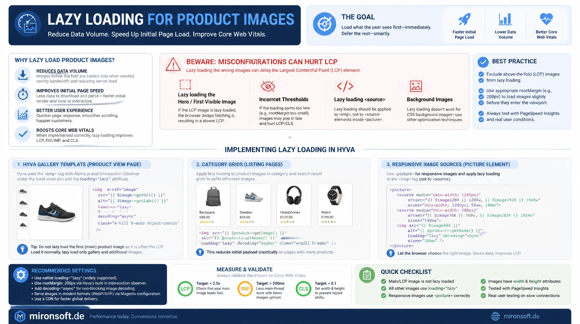
configure it correctly instead of flipping a blanket switch
Lazy loading for product images saves data volume and speeds up the initial page build, but if misconfigured it can delay the very image that decides the Largest Contentful Paint. This article shows how to configure this technique in Hyva gallery templates, category grids and responsive image sources so that load time and Core Web Vitals benefit at the same time.
Table of Contents
- 1. Why lazy loading is a double-edged sword for product images
- 2. Native loading="lazy": browser support, heuristics and limits
- 3. Adapting the product gallery templates in Hyvä
- 4. Above the fold vs. below the fold: what stays eager and what may be lazy
- 5. IntersectionObserver with Alpine.js for category grids
- 6. Avoiding layout shifts: width/height and placeholder strategies
- 7. Responsive images: combining srcset, sizes and lazy loading
- 8. Different strategies for category listing and product detail page
- 9. Testing and validating: Lighthouse, DevTools and RUM
- 10. Summary
- 11. FAQ
1. Why lazy loading is a double-edged sword for product images
Lazy loading for product images is one of the most effective measures to save data volume and reduce the initial load time of a category or product page. A typical category grid with 48 products and three gallery images each generates well over 140 image requests on first page load without lazy loading, even though the visitor actually sees only the first eight to twelve products before scrolling. The browser downloads bytes here that it may never display, tying up bandwidth that is needed for content that is actually visible.
The flip side is just as real: this optimization must never touch the image responsible for the Largest Contentful Paint, which is usually the main image of the first product or the large hero image on the product detail page. If that image is mistakenly shipped with loading="lazy", the browser delays exactly the resource it should request with the highest priority, and the LCP value degrades measurably. This double-edged nature is why a blanket rule such as "lazy load every image" regularly backfires in practice.
This article therefore deliberately covers only the configuration of lazy loading for product images itself: native loading="lazy", adapting the Hyva gallery templates, IntersectionObserver with Alpine.js for category grids, CLS prevention and responsive image sources. General Lighthouse optimization, PHP block caching or CSP configuration are deliberately out of scope because they belong to other topics.
2. Native loading="lazy": browser support, heuristics and limits
All modern browsers, meaning current versions of Chrome, Firefox, Safari and Edge, support the native loading="lazy" attribute without any additional JavaScript. For lazy loading for product images that means: in most cases a single HTML attribute is enough, with no polyfill and no performance overhead from an extra observer running in the JavaScript thread. Internally, the browser decides when to load an image using a distance heuristic, typically a few hundred to a few thousand pixels before it scrolls into the visible area, depending on connection speed and device type.
The limits of this native approach show up as soon as native lazy loading is combined with dynamically appended markup, for example when a category grid is paginated via Ajax or extended with a "load more" button. Images inserted into the DOM after the initial page build still correctly receive loading="lazy" behavior from the browser, but the heuristic reacts with different levels of aggressiveness depending on the browser engine, which can cause visible pop-in when a user scrolls quickly.
Another practically relevant point: Safari handles loading="lazy" somewhat differently from Chromium-based browsers inside nested <picture> elements and within display:none containers. Anyone using this technique inside Alpine.js-driven tabs or accordions should therefore test whether images in initially hidden panels load correctly once the container becomes visible, instead of blindly trusting uniform browser behavior.
3. Adapting the product gallery templates in Hyvä
The default Magento_Catalog gallery renders every gallery image of a product with the same structure, without distinguishing between the first visible image and subsequent thumbnails. For clean lazy loading for product images, the template needs to be adapted so that an image's position in the gallery determines its attributes: the first image loads eager with fetchpriority="high", every subsequent position gets loading="lazy". In Hyva themes, this logic ideally belongs in a ViewModel rather than in procedural template conditions, because the computation can then be tested and reused centrally.
A ViewModel implementing ArgumentInterface that enriches the image collection with an isEager field keeps the template itself lean and readable: instead of scattering index comparisons across the phtml file, the template only checks an already computed property. With PHP 8.4 and constructor property promotion, this class can be built without extra setter methods, which keeps the code consistent across both the Mironsoft and the Abrams module variants.
The layout XML wiring goes through a referenceBlock on the existing gallery block, with the ViewModel injected as an argument rather than overwriting the core Magento_Catalog templates directly. This approach survives Magento minor updates far more robustly, because only the layout argument and the theme's own template live in the theme override, while the block class itself remains unchanged from core.
<!-- app/design/frontend/Mironsoft/default/Magento_Catalog/templates/product/view/gallery.phtml -->
<?php /** @var \Mironsoft\ProductGallery\ViewModel\ProductGallery $galleryViewModel */ ?>
<div class="grid grid-cols-4 gap-3" x-data="{ activeImage: 0 }">
    <?php foreach ($galleryViewModel->getGalleryImages($product) as $position => $image): ?>
        <?php if ($image->isEager()): ?>
            <!-- First image: eager loading, high fetch priority for LCP -->
            <img src="<?= $block->escapeUrl($image->getUrl()) ?>"
                 width="800" height="800"
                 fetchpriority="high"
                 decoding="async"
                 alt="<?= $block->escapeHtmlAttr($image->getLabel()) ?>"
                 class="col-span-4 rounded-xl object-cover">
        <?php else: ?>
            <!-- Subsequent thumbnails: lazy loading is the correct default here -->
            <img src="<?= $block->escapeUrl($image->getThumbnailUrl()) ?>"
                 width="200" height="200"
                 loading="lazy" decoding="async"
                 alt="<?= $block->escapeHtmlAttr($image->getLabel()) ?>"
                 class="rounded-lg object-cover cursor-pointer"
                 @click="activeImage = <?= (int) $position ?>">
        <?php endif; ?>
    <?php endforeach; ?>
</div>
<?php

declare(strict_types=1);

namespace Mironsoft\ProductGallery\ViewModel;

use Magento\Catalog\Api\Data\ProductInterface;
use Magento\Catalog\Helper\Image as ImageHelper;
use Magento\Framework\View\Element\Block\ArgumentInterface;

/**
 * Provides gallery image data with a computed eager/lazy flag based on position.
 */
final class ProductGallery implements ArgumentInterface
{
    /**
     * Number of images that stay eager (typically only the main image).
     */
    private const EAGER_IMAGE_COUNT = 1;

    /**
     * @param ImageHelper $imageHelper Magento image helper for URL resolution
     */
    public function __construct(
        private readonly ImageHelper $imageHelper,
    ) {
    }

    /**
     * Builds the gallery image list with an isEager flag computed by position index.
     *
     * @param ProductInterface $product Current product entity
     * @return GalleryImage[] List of gallery images, first item(s) flagged eager
     */
    public function getGalleryImages(ProductInterface $product): array
    {
        $images = [];
        $position = 0;

        foreach ($product->getMediaGalleryImages() as $mediaImage) {
            $images[] = new GalleryImage(
                url: (string) $mediaImage->getData('medium_image_url'),
                thumbnailUrl: (string) $mediaImage->getData('small_image_url'),
                label: (string) $mediaImage->getLabel(),
                isEager: $position < self::EAGER_IMAGE_COUNT,
            );
            $position++;
        }

        return $images;
    }
}
<!-- app/design/frontend/Mironsoft/default/Magento_Catalog/layout/catalog_product_view.xml -->
<page xmlns:xsi="http://www.w3.org/2001/XMLSchema-instance"
      xsi:noNamespaceSchemaLocation="urn:magento:framework:View/Layout/etc/page_configuration.xsd">
    <body>
        <referenceBlock name="product.info.media">
            <arguments>
                <argument name="gallery_view_model" xsi:type="object">
                    Mironsoft\ProductGallery\ViewModel\ProductGallery
                </argument>
            </arguments>
        </referenceBlock>
    </body>
</page>
4. Above the fold vs. below the fold: what stays eager and what may be lazy
The central decision behind lazy loading for product images is not a technical one but a layout question: which image position is actually inside the visible viewport on first render? On a product detail page that is almost always the main image, occasionally also the first thumbnail in a side-by-side gallery layout on large screens. Anything that only becomes visible after scrolling, such as further gallery images, related products or cross-sell tiles, is a valid candidate for lazy loading.
On category grids, the boundary shifts depending on viewport width: on a mobile device with two columns, often only the first four to six product images are above the fold, while a wide desktop viewport with four or five columns shows twelve to fifteen images without scrolling. A fixed number such as "the first three images stay eager" therefore falls short. A more practical approach is server-side configuration that derives a plausible count of eager-loaded images from the theme's known grid column count, usually somewhere between four and eight.
It is also important that this classification is not static across all pages: a search results page with a filter bar above the grid pushes the visible positions further down, while a landing page without filters shows correspondingly more images in the first viewport. For a consistent configuration, it is therefore worth defining a central constant per page type rather than a single global value.
5. IntersectionObserver with Alpine.js for category grids
Native loading="lazy" reliably covers most cases of lazy loading for product images, but it reaches its limits when a transition effect is desired in addition to plain deferred loading, for example fading in a sharp image over a low-quality placeholder, commonly called a blur-up effect. For such cases, the IntersectionObserver API combined with Alpine.js is a good fit, because the observation state can be modeled directly as an Alpine data object in the markup, without loading an additional JavaScript bundle.
The basic idea: an x-data object holds a boolean state loaded, initially false. When the component mounts, Alpine registers an IntersectionObserver on the container element via x-init. As soon as the element becomes visible to at least a configurable fraction, the callback sets loaded to true, which makes Alpine's :src binding switch from the low-quality placeholder to the full resolution image, and the observer disconnects itself with observer.disconnect() so it stops generating unnecessary callbacks.
This approach costs extra JavaScript code, but it is justified when the visual quality of the transition is part of the brand experience, for example with high-end product photography. For plain lazy loading without a blur-up effect, native loading="lazy" remains the simpler and more resource-friendly choice, because no additional observer needs to run on the main thread.
<!-- Category grid tile with IntersectionObserver-driven blur-up transition -->
<div class="relative overflow-hidden rounded-xl"
     x-data="{
       loaded: false,
       init() {
         const observer = new IntersectionObserver((entries) => {
           entries.forEach((entry) => {
             if (entry.isIntersecting) {
               this.loaded = true;
               observer.disconnect();
             }
           });
         }, { rootMargin: '200px 0px', threshold: 0.1 });
         observer.observe(this.$el);
       }
     }">
    <!-- Low-quality placeholder, always present, prevents layout shift -->
    <img src="/media/catalog/product/cache/placeholder_20x20.webp"
         width="280" height="280"
         class="absolute inset-0 w-full h-full object-cover blur-md scale-105"
         :class="loaded ? 'opacity-0' : 'opacity-100'"
         alt="">
    <!-- Full resolution image, swapped in once the tile intersects the viewport -->
    <img :src="loaded ? '/media/catalog/product/cache/tile_280x280.webp' : ''"
         width="280" height="280"
         loading="lazy" decoding="async"
         class="relative w-full h-full object-cover transition-opacity duration-300"
         :class="loaded ? 'opacity-100' : 'opacity-0'"
         alt="Product tile">
</div>
6. Avoiding layout shifts: width/height and placeholder strategies
Any form of lazy loading for product images is worthless if it worsens Cumulative Layout Shift at the same time. If width and height attributes or an equivalent CSS aspect-ratio declaration are missing, the browser reserves no space for the image before it loads. As soon as the image actually loads, the following content jumps downward, which causes clearly visible, disruptive jank especially on category grids where many images load in at once.
The most reliable fix is to set width and height explicitly as HTML attributes, not only as CSS properties. The browser automatically derives an aspect ratio from these and reserves the corresponding space in the layout before the image file is even requested. In Tailwind CSS v4, this behavior can additionally be secured with the utility class aspect-square or aspect-[4/5] on the surrounding container, in case the actual image size in the catalog varies.
For the transition phase until the image actually becomes visible, it is also worth using a neutral background, such as bg-slate-100, instead of a fully transparent container. A visible but neutral placeholder visually signals to the user that content is still loading at this spot, instead of a glaring white or an empty area that reads like a rendering error. This combination of reserved space and neutral background is the most effective lever against CLS problems related to lazy loading.
7. Responsive images: combining srcset, sizes and lazy loading
A common mistake when implementing lazy loading for product images is treating the lazy-loading attribute in isolation, without also optimizing the actually delivered image size. An image that loads lazily but is still delivered at full desktop resolution to a mobile device with half the screen width gives away a large share of the possible savings. Only the combination of srcset, sizes and loading="lazy" unlocks the full potential.
Magento's catalog image cache already generates several resolution tiers per product image, for example for listing, thumbnail and zoom views. These can be combined in a srcset attribute with width descriptors, while the sizes attribute tells the browser how wide the image is actually rendered at each viewport. The browser selects the matching source from that before it actually loads anything, which brings noticeable savings in transferred data volume especially on category grids with many columns.
For art-direction cases, such as a different aspect ratio on mobile versus desktop, <picture> is combined with several <source> elements and a final <img> fallback. The same rule applies here: the loading="lazy" attribute belongs on the <img> element, not on the <source> elements, since only the <img> tag is evaluated by the browser for the lazy-loading decision.
<!-- Responsive product image: srcset + sizes combined with lazy loading -->
<picture>
  <source
    srcset="/media/catalog/product/cache/tile_400x400.webp 400w,
            /media/catalog/product/cache/tile_600x600.webp 600w,
            /media/catalog/product/cache/tile_800x800.webp 800w"
    sizes="(max-width: 640px) 50vw, (max-width: 1024px) 33vw, 25vw"
    type="image/webp">
  <img
    src="/media/catalog/product/cache/tile_600x600.webp"
    srcset="/media/catalog/product/cache/tile_400x400.jpg 400w,
            /media/catalog/product/cache/tile_600x600.jpg 600w,
            /media/catalog/product/cache/tile_800x800.jpg 800w"
    sizes="(max-width: 640px) 50vw, (max-width: 1024px) 33vw, 25vw"
    width="600" height="600"
    loading="lazy" decoding="async"
    alt="Product name"
    class="w-full h-full object-cover rounded-lg">
</picture>
8. Different strategies for category listing and product detail page
Lazy loading for product images needs a different configuration on the category listing page than on the product detail page, because the two page types have a fundamentally different image-to-content ratio. A category page potentially shows dozens of product images at once, of which only a small share is above the fold, which is why the largest share of the savings from lazy loading occurs here. The product detail page, by contrast, usually shows only four to eight gallery images of a single product, of which the first is almost always immediately visible.
On the product detail page, it is therefore worth being more generous with the eager-loaded boundary, for example the first two to three positions, because a user clicking a thumbnail often jumps straight to the next image, and noticeable pop-in worsens the perception of responsiveness. On the category page, by contrast, a tight boundary limited to the actually visible first rows makes sense, because here the sheer number of images is the dominant performance problem, not the switching speed of individual images.
In practice, this distinction is cleanest to model through two separate ViewModels, or through a configuration parameter that stores the number of eager-loaded images per page type in the module's system configuration section, rather than hardcoding the number in code. That makes it possible to tune the threshold later based on real usage data, without triggering a deploy.
9. Testing and validating: Lighthouse, Chrome DevTools and Real User Monitoring
Whether a configuration of lazy loading for product images actually works can be read off the Lighthouse report in two places: the "Defer offscreen images" audit should no longer list any below-the-fold images after implementation, while the Largest Contentful Paint value must remain unchanged and good, because the decisive image still loads eager. A worsened LCP value after introducing lazy loading is a reliable sign that the position detection in the ViewModel is faulty and the actual above-the-fold image was accidentally marked lazy.
Chrome DevTools' network throttling set to "Slow 3G" or "Fast 4G" offers a realistic way to observe pop-in behavior under poor connections. In the Network panel, filtering by image files additionally lets you check whether only a few images are actually requested during the initial page build and the remaining requests only fire on scroll. The Performance tab further shows whether an additional IntersectionObserver produces measurable script execution time on the main thread.
Lab data from Lighthouse and DevTools alone is not enough, because it is measured under controlled, ideal conditions. Real User Monitoring, for example via the Chrome User Experience Report data in Google Search Console, shows whether the optimization also achieves the desired effect on load time and Cumulative Layout Shift for real users with different devices and network connections, instead of just looking good in the lab.
Image position compared directly: The following overview shows typical misconfigurations of this technique and the recommended fix for each.
| Image position | Wrong | Recommended | Effect |
|---|---|---|---|
| Hero / main image | loading="lazy" |
eager, fetchpriority="high" |
Largest Contentful Paint stays stable |
| Gallery thumbnails | eager for every position | loading="lazy" from position 2 |
Fewer requests on initial build |
| width/height | not set | explicit HTML attribute | No Cumulative Layout Shift |
| Image source | fixed desktop resolution | responsive srcset/sizes |
Fewer bytes transferred on mobile |
| Transition effect | no placeholder | blur-up placeholder | Calmer visual loading impression |
Mironsoft
Hyvä development, image optimization and Magento 2 operations
Are product images slowing your store down?
We configure lazy loading for product images in your gallery templates and category grids so that the Largest Contentful Paint stays stable while unnecessary data volume disappears.
Image audit
Analysis of gallery, category grid and LCP image with a prioritized action list
Implementation
ViewModel, layout XML and Alpine.js components adapted in live operation
Validation
Lighthouse, DevTools throttling and CrUX field data after rollout
10. Summary
An effective configuration of lazy loading for product images is not a blanket switch but a position-dependent decision: the LCP-relevant main image stays eager with fetchpriority="high", every subsequent gallery and grid image gets native loading="lazy". In Hyva themes, this logic belongs in a ViewModel that translates the position in the image array into a simple isEager flag, instead of scattering conditions across the template. IntersectionObserver with Alpine.js complements this approach wherever a blur-up transition is additionally desired.
Just as important as the lazy-loading decision itself are the accompanying measures: explicit width and height attributes against Cumulative Layout Shift, responsive srcset/sizes declarations against unnecessarily large image files on mobile devices, and a different configuration for category listing and product detail page. Only the combination of all these building blocks turns this optimization into a measure that measurably pays off both in the Lighthouse lab and with real users.
Lazy Loading for Product Images: The Essentials at a Glance
LCP image
Always eager with fetchpriority="high", never loading="lazy" on the main image.
Gallery & grid
ViewModel computes isEager per position, everything below the fold gets loading="lazy".
CLS & responsive
Explicit width/height, combined with srcset and sizes.
Validation
Check Lighthouse, DevTools throttling and CrUX field data after every rollout.