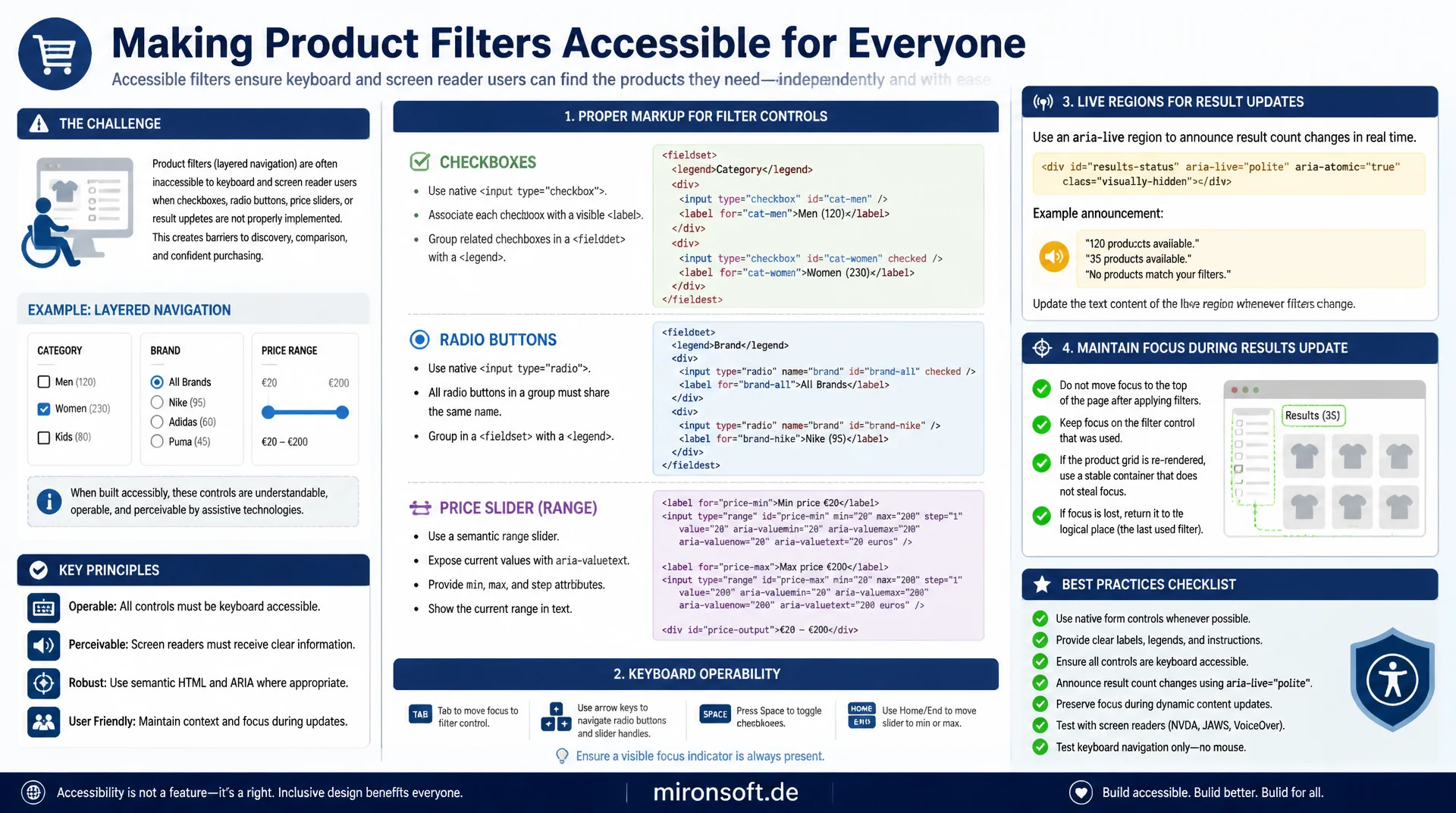
Keyboard, live regions, and focus management for store filters
Product filters that only work with a mouse, or that drop focus after every selection, effectively lock out keyboard and screen reader users. This article shows how to mark up checkboxes, radio buttons, and price sliders correctly in a layered navigation, make them keyboard operable, and combine them with live regions for updated result counts, all without losing focus when the product grid reloads.
Table of Contents
- 1. Why accessible product filters decide conversion and legal compliance
- 2. Semantic structure: fieldset, legend, and label for filter groups
- 3. Keyboard operability: checkboxes, radio buttons, and focus visibility
- 4. Live regions: announcing the updated result count after filtering
- 5. Focus management: no lost focus when the product grid re-renders
- 6. ARIA patterns for multiselect dropdowns and filter chips
- 7. Building an accessible price range slider
- 8. Practical pattern: layered navigation with Alpine.js in Hyva
- 9. Testing and comparison: screen readers, axe-core, and common mistakes
- 10. Summary
- 11. FAQ
1. Why accessible product filters decide conversion and legal compliance
Product filters are the central control in almost every online store, the difference between hundreds of products and the handful that actually fit. When that control only works with a mouse, it effectively excludes keyboard users, screen reader users, and people with motor impairments from product discovery. That is not just a legal risk under the German Accessibility Strengthening Act (BFSG), which has applied to B2C online stores since June 2025, it is also a hard conversion problem: a customer who cannot operate a filter leaves the site instead of buying.
In practice, product filters fail at the same recurring spots: checkboxes without a visible label, custom dropdowns without keyboard support, result counts that change unnoticed, and a product grid that throws focus back to the page body after every click. Every one of these mistakes can be fixed with established WAI-ARIA patterns and a few lines of semantic HTML, as the following sections show using a layered navigation for Magento and Hyva as the example.
2. Semantic structure: fieldset, legend, and label for filter groups
Each filter group, such as color or size, belongs inside a native <fieldset> element with a <legend> as its group title. Screen readers automatically announce the legend as soon as focus reaches the first checkbox in the group, so users know the context of the option without hearing every single label repeated. A plain <div> with a visually bold heading does not provide that association, because the grouping only exists visually, not programmatically.
Every single checkbox needs a <label> bound to the checkbox's id via the for attribute, never just a surrounding <span> styled with CSS. The visible text should include the match count, for example Red (12), so screen reader users know how many products to expect before selecting an option. aria-describedby can add supplementary hints such as multiple selection allowed without lengthening the primary label text.
<!-- Filter group: fieldset + legend, each checkbox with a bound label -->
<fieldset class="border-0 p-0 m-0 mb-6">
  <legend class="font-bold text-slate-800 text-sm mb-3">Color</legend>
  <ul class="space-y-2 list-none m-0 p-0">
    <li>
      <input
        type="checkbox"
        id="filter-color-red"
        name="color[]"
        value="red"
        class="w-4 h-4"
        aria-describedby="filter-color-red-hint"
      >
      <label for="filter-color-red" class="ml-2 text-sm text-slate-700">Red (12)</label>
      <span id="filter-color-red-hint" class="sr-only">Multiple selection allowed</span>
    </li>
    <li>
      <input type="checkbox" id="filter-color-blue" name="color[]" value="blue" class="w-4 h-4">
      <label for="filter-color-blue" class="ml-2 text-sm text-slate-700">Blue (7)</label>
    </li>
  </ul>
</fieldset>
3. Keyboard operability: checkboxes, radio buttons, and focus visibility
Checkboxes and radio buttons are reachable with the Tab key and operable with the Space bar or arrow keys by default, as long as they remain native HTML elements and are not replaced with <div> or <span> constructs driven by click handlers. The problem usually appears once designers hide the native checkbox completely (display: none) and replace it with a purely visual element that no longer has any keyboard interaction at all.
The safe approach is to keep the native checkbox visually hidden but focusable with an sr-only-style class, and drive the visual replacement element through the :checked and :focus-visible selectors. That way the checkbox retains its full keyboard and screen reader logic while the design remains freely stylable. A clearly visible focus ring with sufficient contrast, at least 3:1 per WCAG 2.2 criterion 2.4.11, is mandatory, especially since many store themes remove the browser's default focus ring via CSS without replacing it.
/* Real checkbox stays in the DOM and keyboard-focusable, only visually hidden */
.filter-checkbox {
  position: absolute;
  width: 1px;
  height: 1px;
  padding: 0;
  margin: -1px;
  overflow: hidden;
  clip: rect(0, 0, 0, 0);
  white-space: nowrap;
  border: 0;
}

/* Custom visual box driven by the real checkbox state */
.filter-checkbox + .filter-checkbox-box {
  width: 1.25rem;
  height: 1.25rem;
  border: 2px solid #71717a;
  border-radius: 0.25rem;
}

.filter-checkbox:checked + .filter-checkbox-box {
  background-color: #18181b;
  border-color: #18181b;
}

/* Visible, high-contrast focus ring, only on keyboard focus */
.filter-checkbox:focus-visible + .filter-checkbox-box {
  outline: 3px solid #3f3f46;
  outline-offset: 2px;
}
4. Live regions: announcing the updated result count after filtering
When a filter is toggled and the product grid updates via AJAX, the result count changes visually right away, but without aria-live that change stays invisible to screen reader users. The fix is a dedicated live region, an element with aria-live="polite" and role="status", containing only the current match count, updated via JavaScript on every filter change. Polite means the announcement waits until the screen reader finishes its current speech output instead of interrupting it.
It matters to leave the live region empty in the DOM on the initial page load and only set its text after the first user interaction, otherwise the screen reader announces the match count while the page is still loading, before any filter was actually applied. The region should not be visually hidden entirely, instead the regular, visible result-count display itself should be marked as the live region, so sighted and blind users receive the same information at the same time.
<!-- Visible result count doubles as the live region, no separate hidden element -->
<p
  id="filter-result-count"
  role="status"
  aria-live="polite"
  aria-atomic="true"
  class="text-sm font-semibold text-slate-700 mb-4"
>
  128 products
</p>

<script>
function updateResultCount(newCount) {
  const region = document.getElementById('filter-result-count');
  // aria-atomic ensures the full sentence is re-announced, not just the diff
  region.textContent = newCount + ' products found';
}
</script>
5. Focus management: no lost focus when the product grid re-renders
Probably the single biggest real-world UX mistake with AJAX filters: after every click, the entire product grid container is replaced via innerHTML, which removes the previously focused checkbox node from the DOM. The browser then automatically throws focus back to the <body> element, and keyboard users have to tab through the whole page from the top again just to reach the next filter. For screen reader users, it feels as if the entire page reloaded.
The correct pattern leaves the filter container that owns focus untouched and only replaces the product grid area. In addition, the script remembers which element was focused before the re-render and explicitly restores focus via element.focus() afterward, in case the original element did have to be re-rendered. For the case where the focused node truly gets replaced, a tabindex="-1" on a stable anchor element such as the results heading is a proven fallback for moving focus there programmatically.
// Preserve keyboard focus across an AJAX re-render of the product grid
async function applyFilter(url) {
  const activeElement = document.activeElement;
  const activeId = activeElement && activeElement.id;

  const response = await fetch(url, { headers: { 'X-Requested-With': 'XMLHttpRequest' } });
  const html = await response.text();

  // Only the grid is replaced, the filter fieldset stays untouched in the DOM
  document.getElementById('product-grid').innerHTML = html;
  updateResultCount(document.querySelectorAll('.product-card').length);

  // Restore focus if the original node still exists after the swap
  const restored = activeId && document.getElementById(activeId);
  if (restored) {
    restored.focus();
    return;
  }

  // Fallback: move focus to a stable, always-present anchor heading
  const anchor = document.getElementById('filter-result-heading');
  anchor.setAttribute('tabindex', '-1');
  anchor.focus();
}
6. ARIA patterns for multiselect dropdowns and filter chips
Custom dropdowns for filters, such as a multiselect menu for brands, need the WAI-ARIA listbox or combobox pattern, not a hand-rolled div construct without roles. A button with aria-haspopup="listbox" and aria-expanded opens the list, marked up as a ul with role="listbox", each item as an li with role="option" and aria-selected. Arrow keys navigate between options, Space or Enter selects, and Escape closes the menu and returns focus to the triggering button.
Active filters shown as removable chips above the product grid each need their own button with a unique aria-label such as Remove filter Color Red, instead of a generic cross icon without a text alternative. After removing a chip, focus should not fall into empty space, it should move to the next remaining chip or, if none remain, back to the corresponding filter checkbox in the fieldset group.
7. Building an accessible price range slider
A price filter with two handles for minimum and maximum can be built with either two native input[type=range] elements or the WAI-ARIA slider pattern (role="slider"). The native option is considerably more robust, because keyboard control with arrow keys, page up, page down, home, and end works automatically, without writing custom JavaScript for every key. Two overlapping range inputs with different z-index values are the common pattern for a dual slider, with each handle carrying its own aria-label such as Minimum price or Maximum price.
If a fully custom-styled slider component is built instead, aria-valuemin, aria-valuemax, and aria-valuenow must be kept current on every movement, along with an aria-valuetext that formats the value in a readable way, for example 49 euros instead of just the raw number 49. Without aria-valuetext, some screen readers only read the raw digit, which is ambiguous for currency or percentage values. The handle's focus ring must stay visible on every keyboard input, even while the value changes in real time.
8. Practical pattern: layered navigation with Alpine.js in Hyva
In Hyva, an accessible layered navigation can be built entirely with an Alpine.js component, without loading any additional JavaScript libraries. The component holds the loading state, the current match count, and a reference to the last focused element in its local state, and updates both the product grid and the live region with the new match count after every AJAX request, without re-rendering the rest of the page.
The key trick in the example below: the x-init hook remembers the active element before the fetch call, and after inserting the new product cards, the component checks whether that element still exists in the DOM. If it does, focus stays unchanged. If it is gone, focus moves explicitly to the results-count heading, which carries a tabindex="-1" for that purpose, making it programmatically focusable without joining the normal tab order.
// Hyva_Theme::product/layered-nav.phtml - Alpine.js component
document.addEventListener('alpine:init', () => {
  Alpine.data('layeredNav', () => ({
    loading: false,
    resultCount: 0,

    async toggleFilter(event, url) {
      this.loading = true;
      const lastFocusedId = document.activeElement.id;

      try {
        const response = await fetch(url, {
          headers: { 'X-Requested-With': 'XMLHttpRequest' }
        });
        const data = await response.json();

        // Replace only the grid, the fieldset filters stay mounted
        document.getElementById('product-grid').innerHTML = data.gridHtml;
        this.resultCount = data.count;

        // Announce the new count through the existing live region
        this.$refs.liveRegion.textContent = data.count + ' products found';

        // Restore focus to the same control if it still exists
        this.$nextTick(() => {
          const restored = document.getElementById(lastFocusedId);
          if (restored) {
            restored.focus();
          } else {
            this.$refs.resultHeading.focus();
          }
        });
      } finally {
        this.loading = false;
      }
    }
  }));
});
9. Testing and comparison: screen readers, axe-core, and common mistakes
Automated tools such as axe-core or Lighthouse accessibility audits reliably find missing labels, insufficient contrast, and missing ARIA attributes, but they do not detect focus loss after an AJAX update or incorrectly phrased live region announcements. That is why every layered navigation additionally needs a manual test with a real screen reader: NVDA with Firefox on Windows or VoiceOver with Safari on macOS are the most common combinations for the European market.
During the manual test, filtering happens entirely with the keyboard, no mouse at all, checking whether every live region announcement is accurate and timely, whether focus lands in a sensible place after every interaction, and whether custom dropdowns respond as expected to arrow keys, Escape, and Enter. The following table compares typical implementation mistakes with their accessible counterpart.
| Area | Not accessible | Accessible pattern | Benefit |
|---|---|---|---|
| Filter group | div with a bold heading | fieldset + legend | Group context announced programmatically |
| Checkbox replacement | div with onclick, display: none checkbox | Native checkbox, sr-only + :checked | Keyboard and screen reader logic preserved |
| Result count | Visual text change only | role="status" aria-live="polite" | Screen reader announces the new count |
| Grid update | innerHTML of the whole container | Remember focus, restore it explicitly | No fallback of focus to body |
| Price slider | Custom build without aria-valuenow | input[type=range] or role="slider" + aria-valuetext | Value read out correctly and clearly |
Mironsoft
Accessibility audits and WCAG-compliant implementation for Magento and Hyva stores
Product filters that are truly usable for everyone?
We audit your layered navigation for keyboard operability, live regions, and focus management, then implement the necessary changes directly in your Hyva theme, so your store meets the BFSG and stays usable for every customer.
Accessibility audit
Keyboard, screen reader, and axe-core testing of your filters and forms
Hyva implementation
ARIA patterns, live regions, and focus management built directly into the theme
BFSG consulting
Understand legal requirements and get a prioritized implementation plan
10. Summary
Accessible product filters always solve the same underlying problem: users who cannot or do not want to work with a mouse must not be excluded from product discovery. Semantic HTML with fieldset and legend, native checkboxes with a visible focus ring instead of rebuilt ones, an aria-live region for the match count, and focus management that preserves the last focused node across AJAX updates together form a complete, accessible pattern for layered navigation.
The biggest lever is applying these patterns consistently to every filter component, not just the simple checkbox lists. Custom dropdowns, filter chips, and price sliders each need their own ARIA roles and keyboard handling. Automated tools such as axe-core find a large share of the obvious mistakes, but only a manual test with a real screen reader reliably shows whether live regions and focus management actually work together in practice.
Accessible product filters, the essentials at a glance
Semantic structure
fieldset + legend per filter group, every checkbox with a bound label instead of pure CSS styling.
Live region
role="status" with aria-live="polite" for the match count, updated on every filter change.
Focus management
Remember the active element before the re-render, restore it afterward, or move focus deliberately to a stable heading.
Testing
axe-core for automated baseline checks, NVDA/VoiceOver for manual testing of live regions and focus.