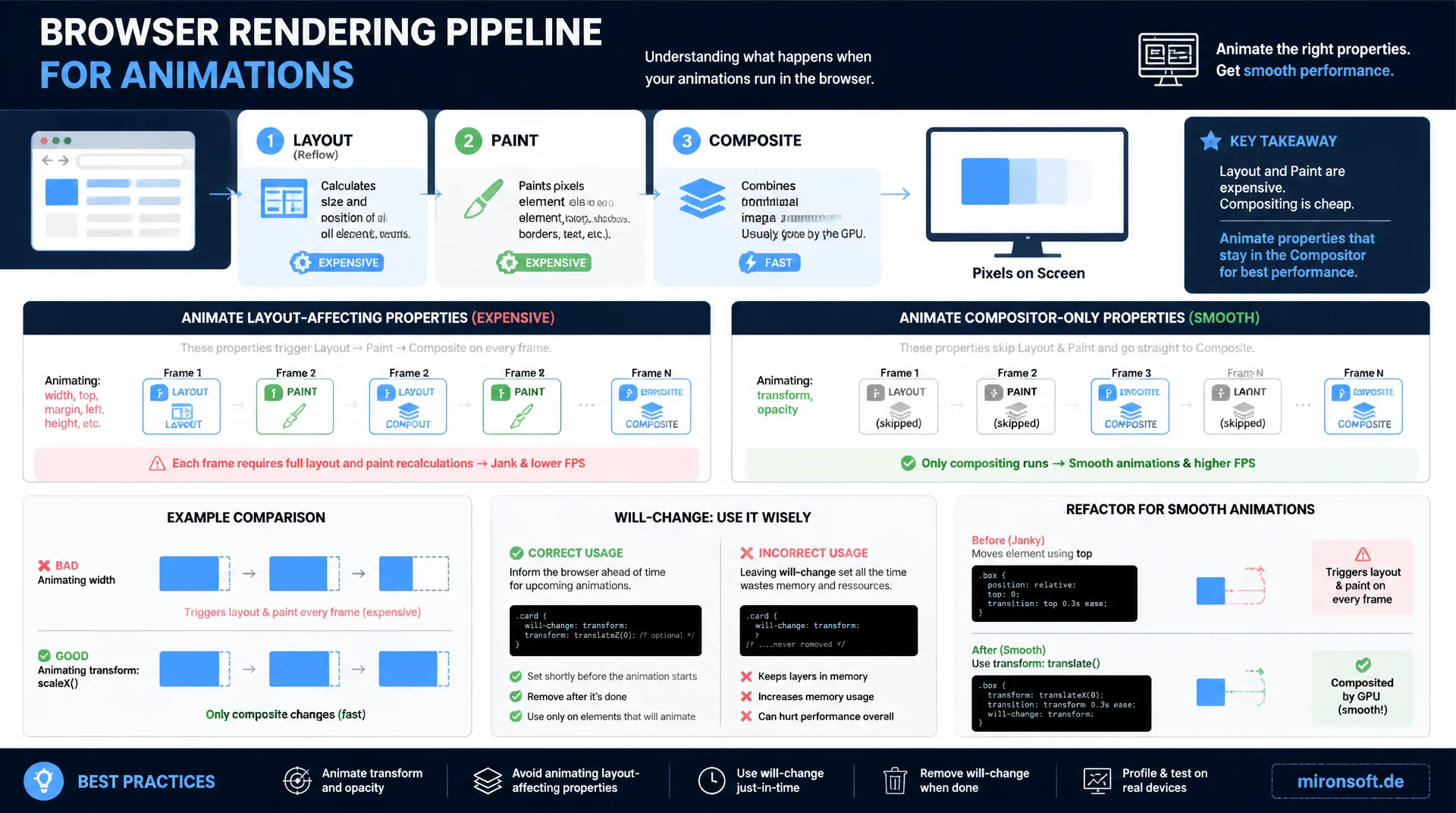
Why some animations stutter and others run buttery smooth
Every animation passes through the browser's rendering pipeline of layout, paint, and composite, and animating width, top, or margin forces the browser into expensive recalculations on every single frame. This article shows why transform and opacity run almost for free on the compositor thread, how to use will-change correctly, and how to refactor existing animations for real gains.
Table of Contents
- 1. Why animation performance makes the difference
- 2. The rendering pipeline: layout, paint, and composite
- 3. Which CSS properties trigger layout, paint, or composite
- 4. Why transform and opacity are almost free
- 5. will-change: benefits and costs
- 6. Practical refactoring examples
- 7. requestAnimationFrame for JS-driven animations
- 8. The FLIP technique for layout animations
- 9. Measuring with Chrome DevTools: Rendering tab and Performance panel
- 10. Summary
- 11. FAQ
1. Why animation performance makes the difference
A 60 Hz screen refreshes every 16.7 milliseconds. For an animation to be perceived as smooth, the browser must fully complete style calculation, layout, paint, and composite within that exact window before the next frame is due. If the time runs out, a frame gets dropped, visible as a brief stutter or jank. Unlike load times, where users tolerate some wait, torn animations stand out immediately because the human eye is extremely sensitive to irregularities in motion.
In Magento and Hyvä stores, this affects every interaction with visual feedback: opening the mobile menu, sliding in the cart drawer, hover effects on product cards, and Alpine.js x-transition transitions on modals or filters. A stuttering menu immediately feels unfinished and cheap, even if the page's actual load time is excellent. Animation performance is therefore not a cosmetic detail but a directly perceivable quality signal, independent of server response times or bundle sizes.
2. The rendering pipeline: layout, paint, and composite
After every style change, the browser potentially runs through four stages. First, style calculation determines which CSS rules apply to which element. Next comes layout (also called reflow): the browser computes the exact size and position of every element in the document. Because elements affect one another, a single size change can trigger a recalculation of the entire document tree, not just the affected element.
After that, paint rasterizes individual elements into pixels on separate layers, including colors, shadows, and rounded corners. The final stage, composite, combines these already-rasterized layers via the GPU into the final image, without touching layout or paint again. The crucial point: composite is orders of magnitude cheaper than layout and paint, because it only shifts, scales, or blends existing bitmaps instead of recomputing pixels. Any animation that runs exclusively at the composite stage therefore skips the two most expensive steps of the pipeline entirely.
3. Which CSS properties trigger layout, paint, or composite
CSS properties fall roughly into three cost classes. Layout-triggering properties such as width, height, top, left, margin, padding, or font-size force the browser to recompute geometry, and automatically drag paint and composite along with them, since the affected pixels necessarily move. For an animated left value, that means a full layout pass 60 times per second, potentially across the entire visible document tree.
A second class, paint-triggering properties such as color, background-color, box-shadow, or border-radius, skips layout but still forces a re-rasterization of the affected pixels on every frame. That's cheaper than layout but still more expensive than pure compositing, especially for large elements or elaborate shadows with a large blur radius. A particularly sneaky pattern is layout thrashing: if a JavaScript loop alternately writes (e.g. element.style.width) and reads (e.g. element.offsetWidth), every read forces a synchronous layout recalculation before the next frame is even due.
4. Why transform and opacity are almost free
transform and opacity belong to the third class: they trigger neither layout nor paint but are processed directly at the composite stage. The reason lies in the nature of the operations: a translation, scale, or rotation via transform only changes how an already-rasterized layer is positioned on screen, not which pixels that layer contains. The GPU can handle exactly that with a simple matrix multiplication, freshly every frame, without the CPU having to recompute anything.
opacity works analogously: the browser blends two already-existing layers using an alpha value instead of recoloring the underlying pixels. The prerequisite is that the browser has already promoted the animated element to its own compositor layer beforehand, which modern browsers do automatically when they detect transform or opacity transitions. In practice this means: a sidebar animated with transform: translateX() can run buttery smooth at 60fps, while the exact same visual movement via left noticeably stutters on a mobile device, even though the end state looks identical.
5. will-change: benefits and costs
The CSS property will-change tells the browser in advance that an element is about to change, so it can create the corresponding compositor layer ahead of time instead of only at the first animation frame. Without this hint, the first frame of an animation can noticeably stutter, because layer creation itself takes time. With will-change: transform on a hover element, that cold-start effect disappears.
The catch: every promoted layer consumes its own GPU memory, and with too many layers active at once, memory bandwidth can become the limiting factor, which degrades overall performance instead of improving it. Applying will-change blanket-style to every card in a product list is therefore a common anti-pattern. The proven practice: set will-change shortly before the animation starts, for example via JavaScript on the mouseenter event, and remove it again after completion via transitionend, rather than anchoring it permanently in the stylesheet.
6. Practical refactoring examples
The most common refactoring candidates in Magento and Hyvä themes are slide-in menus animated via left or right, and hover effects on product cards that change width or height. Both can be losslessly converted to transform: translateX() or transform: scale() respectively, without changing the visual result. The important part: the element must already sit at the correct base position before the animation, with movement arising purely from the transform offset.
In Hyvä themes, Alpine.js already uses opacity and transform by default via x-transition for enter and leave transitions, which is structurally sound. Still, it's worth auditing your own theme CSS: Tailwind utility classes like transition-all combined with hover classes that change w- or h- implicitly animate layout properties. Replacing them with scale- utilities or an explicit transition-transform class fixes this without any extra JavaScript.
/* Bad: animating "left" triggers a full layout pass on every frame */
.menu-slow {
  position: fixed;
  left: -280px;
  transition: left 0.3s ease;
}
.menu-slow.is-open {
  left: 0;
}

/* Good: animating transform runs entirely on the compositor thread */
.menu-fast {
  position: fixed;
  transform: translateX(-280px);
  transition: transform 0.3s ease;
}
.menu-fast.is-open {
  transform: translateX(0);
}
/* Bad: will-change applied permanently to every product card */
.product-card {
  will-change: transform, opacity;
}

/* Good: promote the layer only right before the animation runs */
.product-card {
  transition: transform 0.2s ease;
}
.product-card:hover {
  will-change: transform;
  transform: scale(1.03);
}
/* Remove the hint again via JS once the transition ends, e.g. on transitionend */
7. requestAnimationFrame for JS-driven animations
For animations that can't be expressed as a CSS transition or keyframe animation, such as physics-based motion or a custom-calculated scroll-to-top effect, requestAnimationFrame (rAF) is the right tool. Unlike setInterval or setTimeout, rAF syncs exactly with the next screen refresh and automatically pauses when the tab runs in the background, avoiding both jank and unnecessary power consumption.
Decisive for smooth rAF animations is strictly separating DOM reads from DOM writes: if the same loop first reads getBoundingClientRect() and then writes styles, layout thrashing results. Instead, all measurements should happen once before the loop, with each frame only writing transform or opacity. Using the timestamp parameter the browser passes to every rAF callback also allows a framerate-independent calculation of animation progress, instead of relying on a fixed number of frames.
// Smooth scroll-to-top driven by requestAnimationFrame, not setInterval
function animateScroll(targetY, duration) {
  const startY = window.scrollY;
  const distance = targetY - startY;
  const startTime = performance.now();

  function step(now) {
    const elapsed = now - startTime;
    const progress = Math.min(elapsed / duration, 1);
    // Ease-out cubic for a natural deceleration
    const eased = 1 - Math.pow(1 - progress, 3);
    window.scrollTo(0, startY + distance * eased);

    if (progress < 1) {
      requestAnimationFrame(step);
    }
  }

  requestAnimationFrame(step);
}
8. The FLIP technique for layout animations
Some effects, such as reordering a product list after a filter change, necessarily involve layout properties like position and size. The FLIP technique (First, Last, Invert, Play) resolves this dilemma by letting the layout change itself happen instantly and without animation, while masking the visual jump using transform. The sequence: first, the starting position is measured (First), then the DOM change is applied immediately and the new position is measured (Last), then the element is visually shifted back to the old position via transform (Invert), and finally animated to the final position (Play).
To the browser, the result looks like a real layout animation, but in fact only a transform animation runs on the compositor. Typical use cases in Magento stores are reordering product cards after a filter change, collapsing a cart line item after removing a product, or toggling between list and grid view on a category page, in each case without the browser having to recompute layout during the actual animation.
// FLIP: First, Last, Invert, Play for a reordering product grid
function flip(element, mutateDom) {
  const first = element.getBoundingClientRect();

  mutateDom();

  const last = element.getBoundingClientRect();
  const deltaX = first.left - last.left;
  const deltaY = first.top - last.top;

  // Invert: jump back to the old visual position using only transform
  element.style.transform = `translate(${deltaX}px, ${deltaY}px)`;
  element.style.transition = 'transform 0s';

  requestAnimationFrame(() => {
    // Play: animate to the identity transform, layout stays untouched
    element.style.transition = 'transform 0.3s ease';
    element.style.transform = '';
  });
}
9. Measuring with Chrome DevTools: Rendering tab and Performance panel
Whether an animation actually runs only on the compositor can be verified precisely with Chrome DevTools, instead of assuming it. In the Rendering tab (accessible via the command menu with Show Rendering), Layout Shift Regions highlights unexpected layout changes in color, while Layer Borders makes visible which elements already have their own compositor layer. The Frame Rendering Stats overlay shows the current framerate live and whether GPU rasterization is active.
In the Performance panel, a recorded interaction provides the most reliable diagnosis: the timeline shows layout and paint events as their own colored bars, usually purple for layout and green for paint. If an animation runs cleanly on the compositor only, none of these bars appear for the entire duration of the animation, only the much narrower composite events. Chrome also explicitly flags forced synchronous layouts as Forced reflow in the timeline, usually with a red warning triangle, making layout-thrashing spots in your own code instantly discoverable.
/* Loading spinner and toast fade-in using compositor-only properties */
@keyframes spin {
  from { transform: rotate(0deg); }
  to   { transform: rotate(360deg); }
}

@keyframes fade-in-up {
  from { opacity: 0; transform: translateY(12px); }
  to   { opacity: 1; transform: translateY(0); }
}

.spinner {
  animation: spin 0.8s linear infinite;
}

.toast {
  animation: fade-in-up 0.25s ease-out;
}
CSS properties compared side by side
The table below maps the most common animated CSS properties to the pipeline stage they trigger and shows which alternative is preferable in practice.
| CSS property | Triggered pipeline stage | Cost | Recommendation |
|---|---|---|---|
| width / height | Layout + paint + composite | High | Use transform: scale() |
| top / left / margin | Layout + paint + composite | High | Use transform: translate() |
| color / background-color | Paint + composite | Medium | Only animate on small areas |
| box-shadow | Paint + composite | Medium | Fade a pre-rendered shadow via opacity |
| transform | Composite only | Low | First choice for movement, scale, rotation |
| opacity | Composite only | Low | First choice for fade effects |
In practice, almost all common UI animations, from slide-ins to modals to hover effects, can be implemented entirely with transform and opacity. For the rare effects that must involve layout properties, the FLIP technique helps mask the layout jump without an animated reflow.
Mironsoft
Animation performance and compositor optimization for Magento and Hyvä stores
Ready to get your animations to 60fps?
We analyze your store's animations with the Chrome Performance panel, identify layout thrashing and expensive properties, and refactor them onto transform and opacity, including Alpine.js transitions.
Animation audit
Performance panel analysis, identifying layout thrashing
Refactoring onto compositor layers
Switching to transform and opacity with zero visual change
Alpine.js transition tuning
Tuning x-transition and rAF animations for Hyvä interactions
10. Summary
Animation performance is decided in the rendering pipeline, not in the eye of the beholder. Animating width, top, left, or margin forces a full layout pass on every frame, while transform and opacity are processed exclusively at the cheap composite stage and thereby reliably hit 60fps. will-change speeds up the animation start, but should be used deliberately and temporarily so it doesn't needlessly burden GPU memory.
For JavaScript-driven animations, requestAnimationFrame syncs motion exactly with the screen refresh, while strictly separating DOM reads from writes prevents layout thrashing. When effects necessarily involve layout properties, such as reordering lists, the FLIP technique bridges the jump with a pure transform animation. Chrome DevTools, with its Rendering tab and Performance panel, provides the objective proof of whether an animation actually runs on the compositor or unknowingly triggers layout and paint.
Animation Performance - The Essentials at a Glance
Avoid expensive properties
width, top, left, margin trigger layout. Always use transform for movement and scale.
Prefer compositor-only
transform and opacity skip layout and paint, running directly on the GPU, for stable 60fps.
Use will-change deliberately
Set it shortly before the animation, remove it afterward. Applying it permanently to many elements is an anti-pattern.
Measure, don't guess
Chrome Performance panel and Rendering tab show layout, paint, and composite events per frame.